Brand Guidelines
Nineteen Twenty Seven - Home to the Guilded Arts
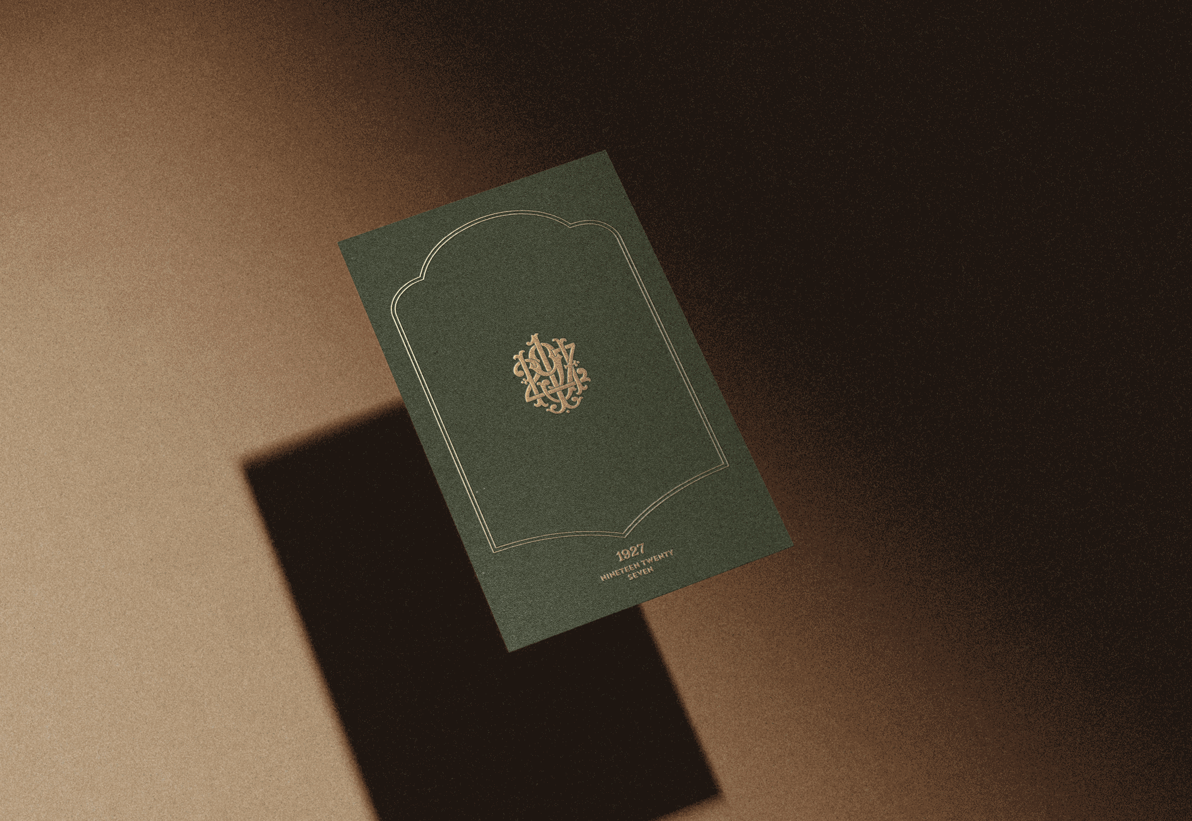
1927
Contents
1927 BRAND GUIDELINES
The 1927 identity is not a single mark — it is a family of emblems, each designed for a different moment of recognition. Together they form a complete visual language. Separately, each one carries the full weight of what 1927 represents.
Logo Family
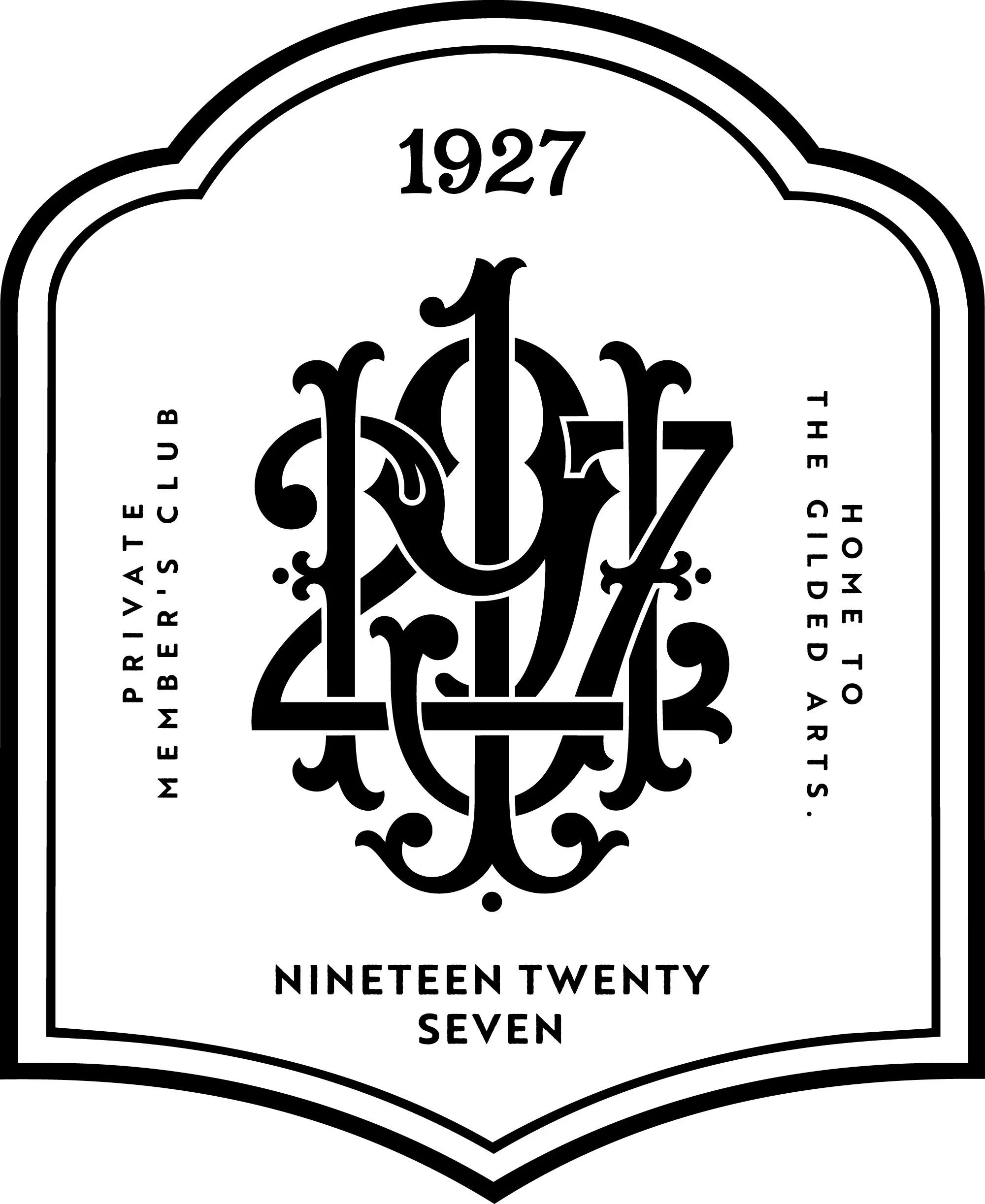
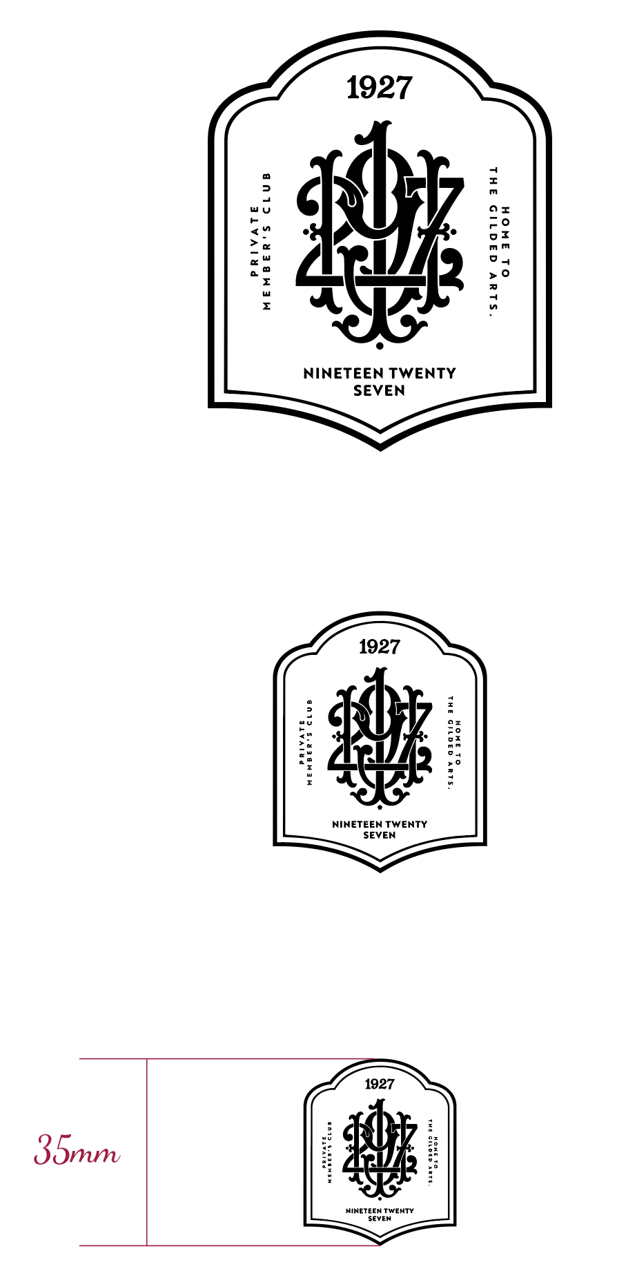
THE SEAL
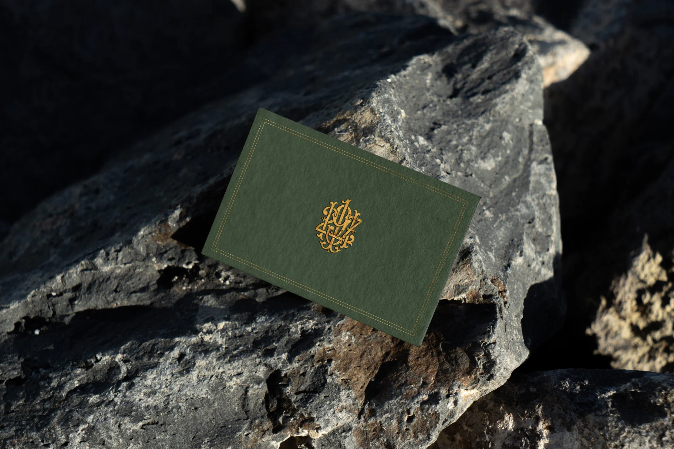
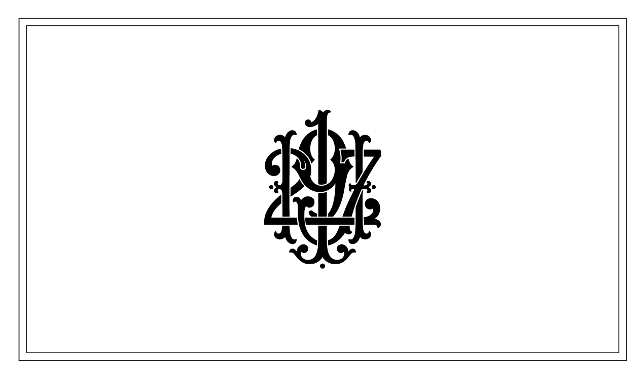
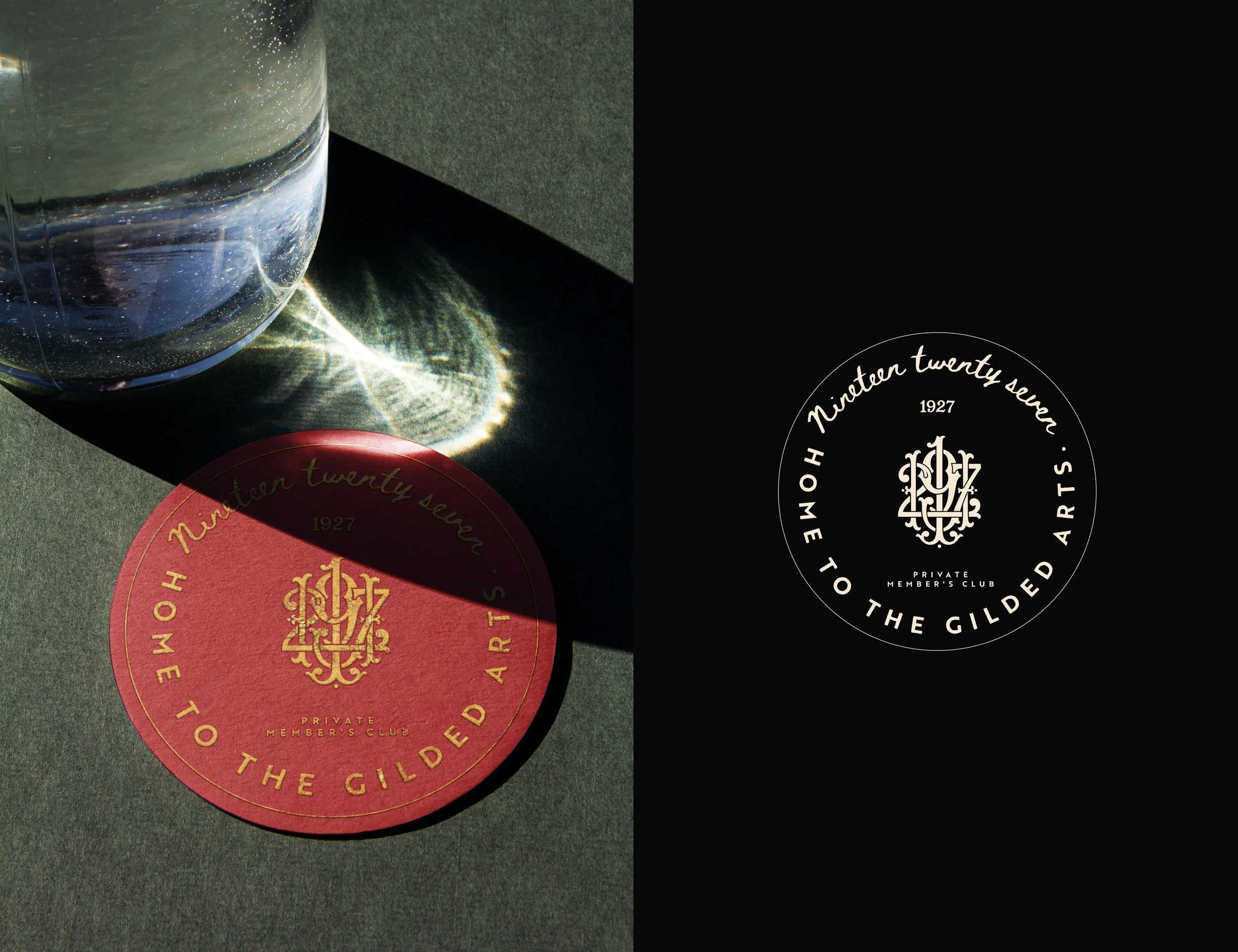
The Seal is the primary expression of the brand. A full badge composition — the ornate monogram at its centre, flanked by the words Private Member's Club and Home to the Gilded Arts, crowned by 1927 and anchored by the wordmark Nineteen Twenty Seven. It is less a logo than a coat of arms: layered, intentional, and built to last.
Usage: The Seal is used when the full force of the brand is required — membership collateral, correspondence, official communications, and any moment where 1927 is being formally introduced.
LOGO USAGE INSTRUCTIONS
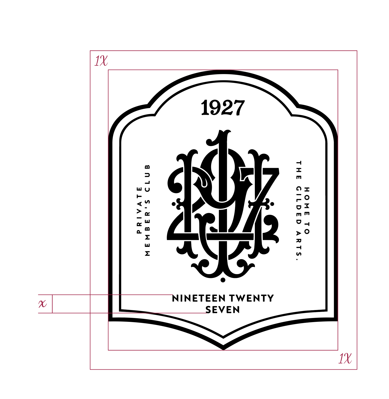
CLEARSPACE
To maintain the logo's visual impact and legibility, always maintain minimum clear space around it.
This spacing rule applies to all edges of the logo lockup, ensuring it stands out clearly in any application.
SCALING
To preserve the integrity and legibility of our logo, never reproduce it smaller than 35mm in height.
This minimum size requirement ensures that all elements of the logo remain clear and recognizable across all applications.
The lion symbol and text must always remain proportional when scaling.
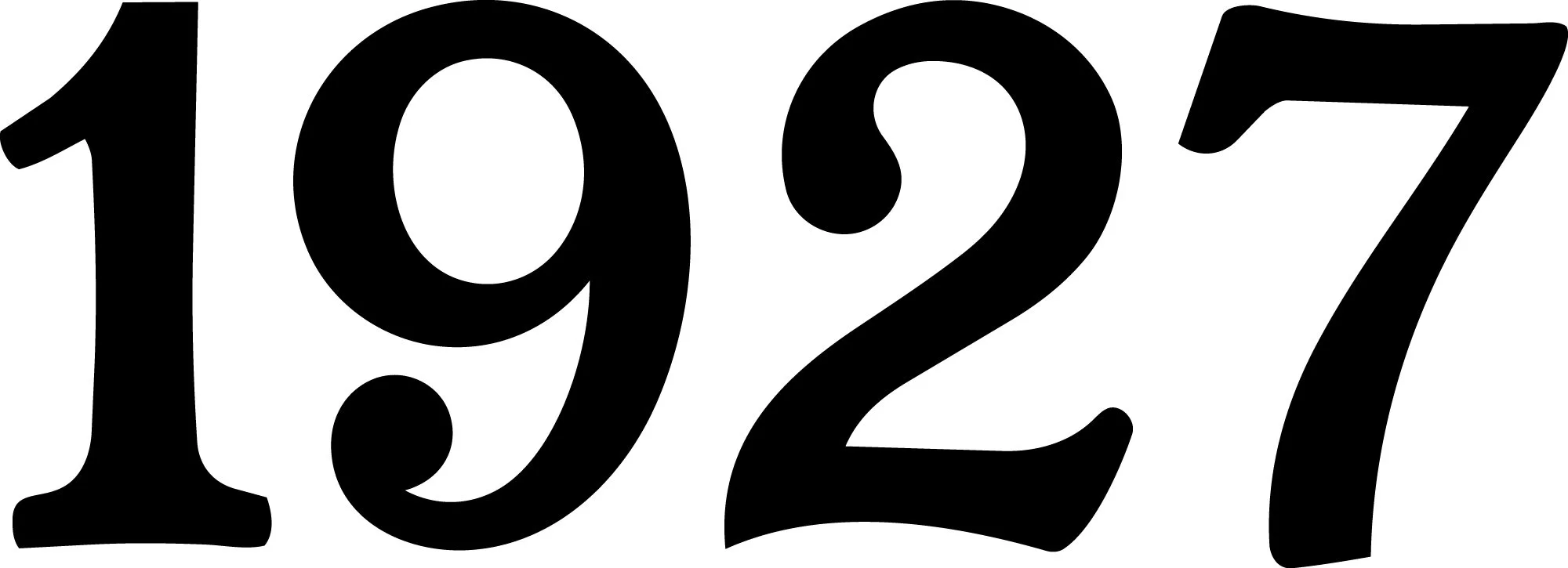
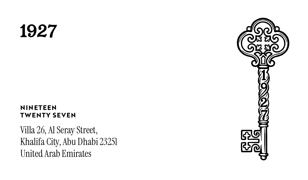
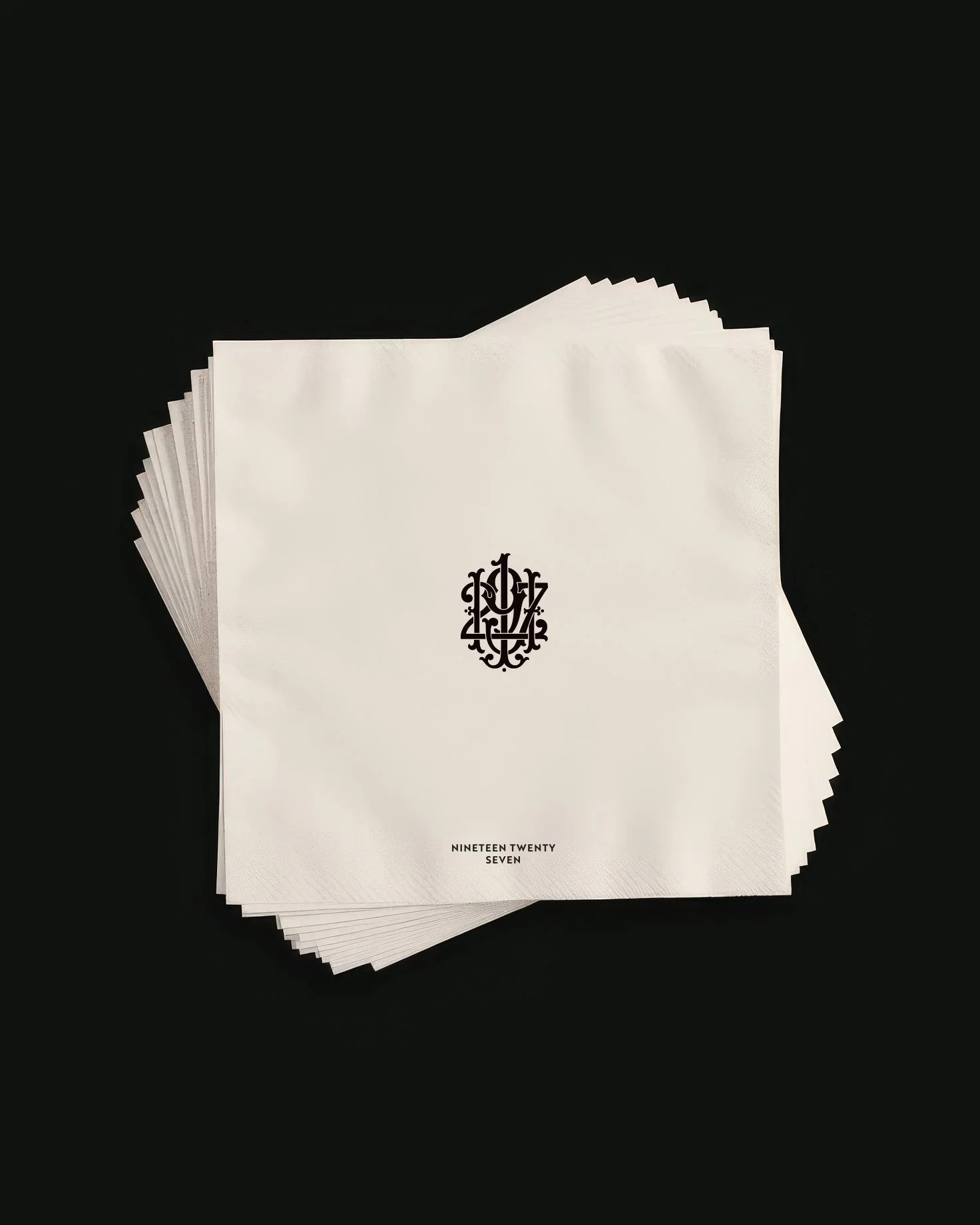
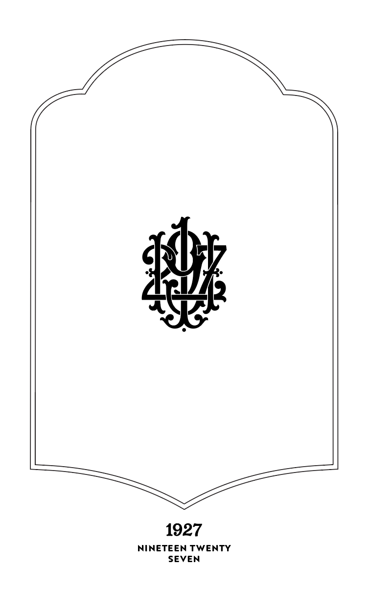
THE NUMERAL
1927 rendered in a single, commanding typeface. No ornament. No context. The year speaks for itself. This mark carries the confidence of a brand that knows its own history — used when recognition is already established and restraint is the most powerful statement.
Usage: Typography-forward contexts where the full Seal would compete with surrounding content, or where the brand's presence should feel understated and assured.
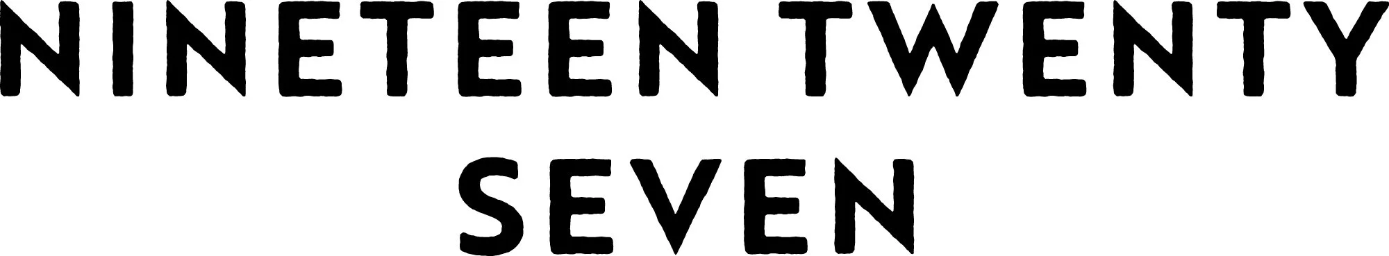
THE WORDMARK
Nineteen Twenty Seven — set in wide, uppercase letters with deliberate spacing. The full name, spelled out. It has the patience of something that has always existed and the clarity of something that intends to endure.
Usage: Text-heavy applications, co-branding contexts, and wherever the brand name needs to be read and understood rather than recognized as a symbol.
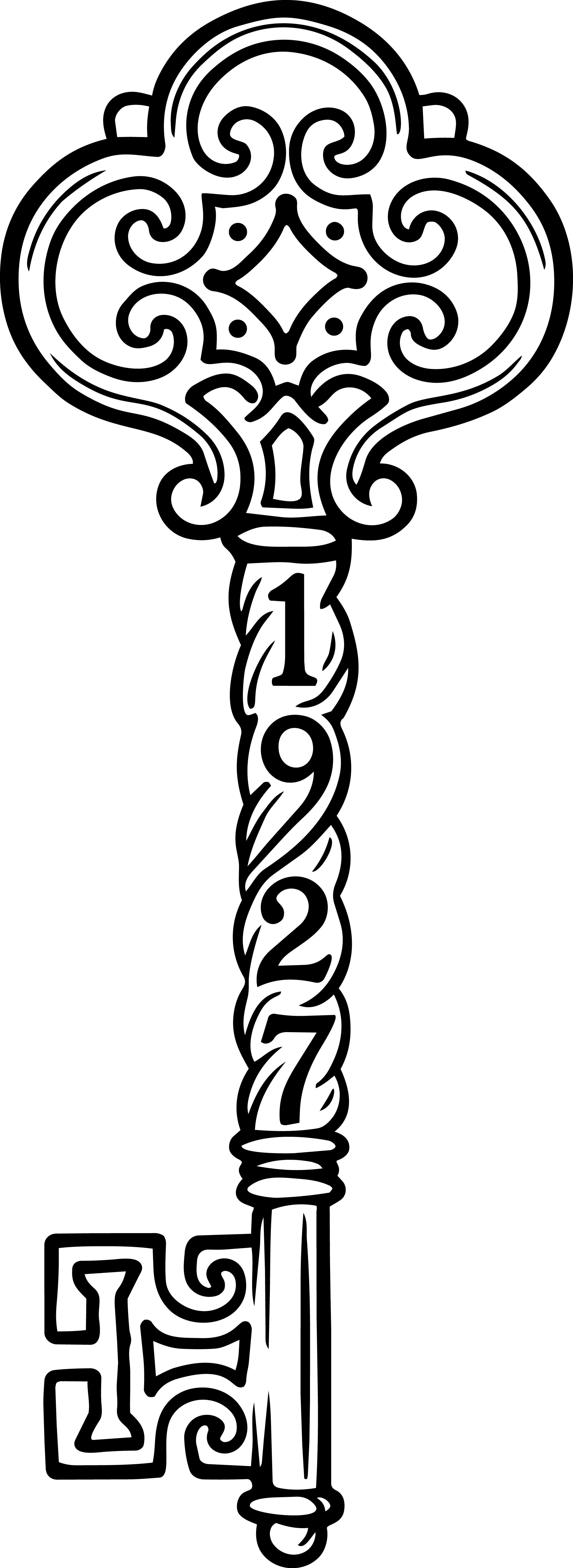
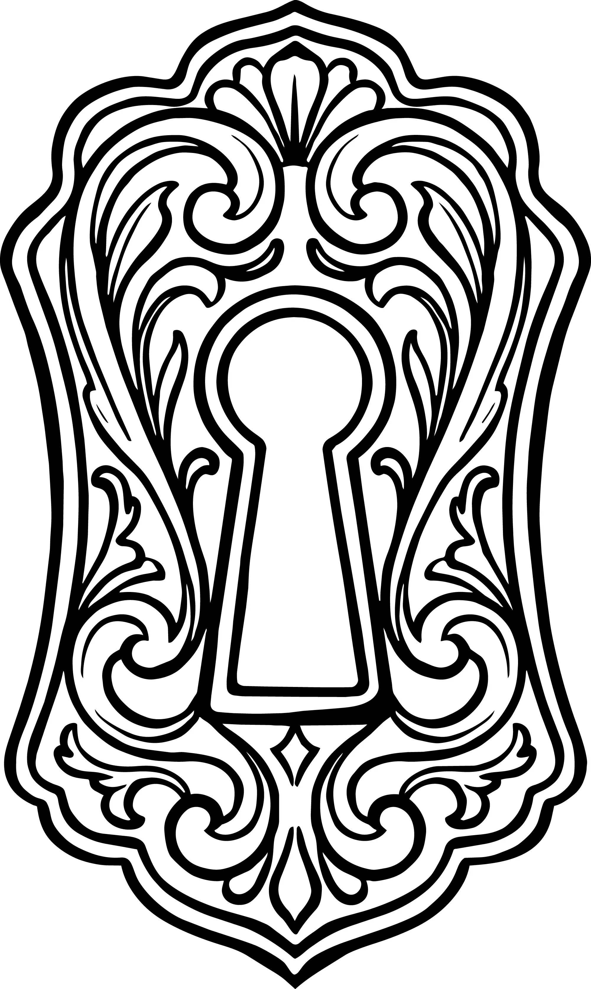
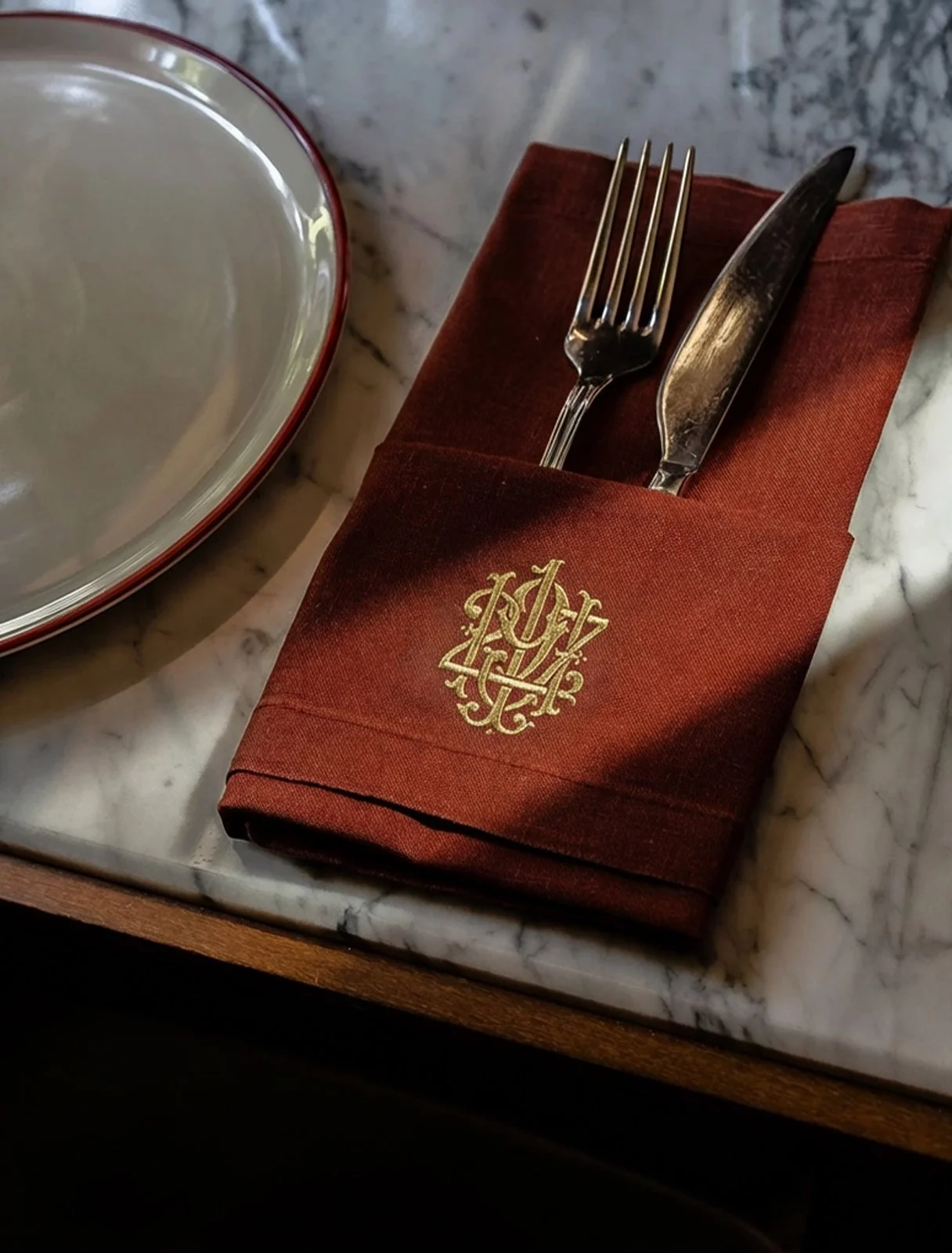
THE ICON
The key is the House's oldest symbol — access, trust, and the quiet privilege of belonging. The 1927 key icon carries the numerals within its form, a detail that rewards those who look closely. Paired with its keyhole, it tells a complete story: there is something worth entering, and not everyone holds the key.
Usage: Social media profile images, favicon, merchandise, watermarks, and any application where the full mark would be impractical. The icon works where space is tight but presence still matters.
Color System
The palette of 1927 was not chosen — it was found. In the deep burgundy of velvet cinema seats. In the warm shadow of a room lit by a single projector. In the gold of a frame that has hung long enough to become part of the wall.
The colors move between darkness and warmth, between formality and feeling. They are not decorative — they are atmospheric.
The primary palette anchors the brand in depth and gravity. The warm tones — the cream, the sand, the gold foil — breathe light into it. Used together, they create the particular quality of 1927: serious but never cold, refined but never remote.
Gold Foil is reserved for the moments that matter most. It is not an accent — it is a statement of craft.
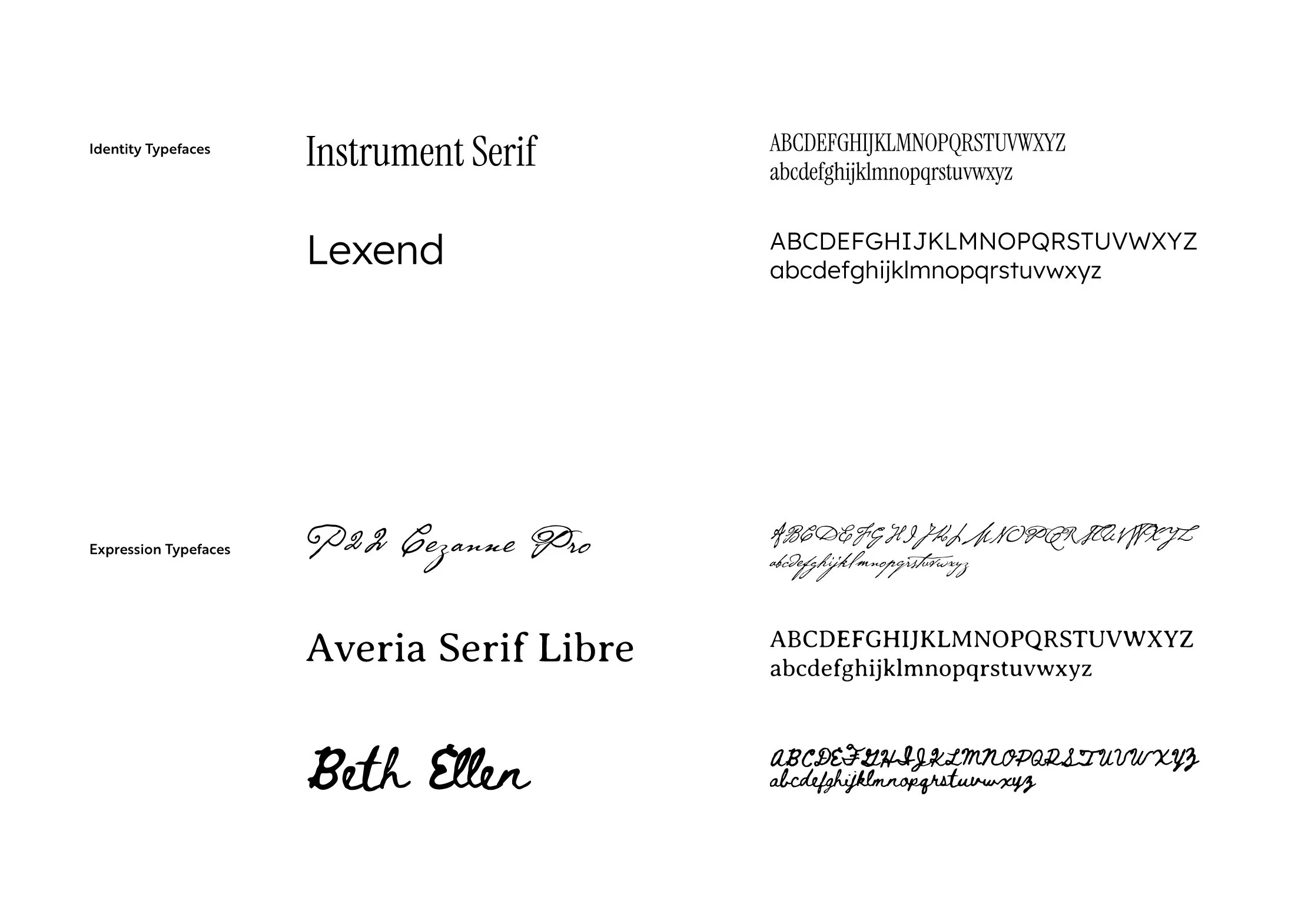
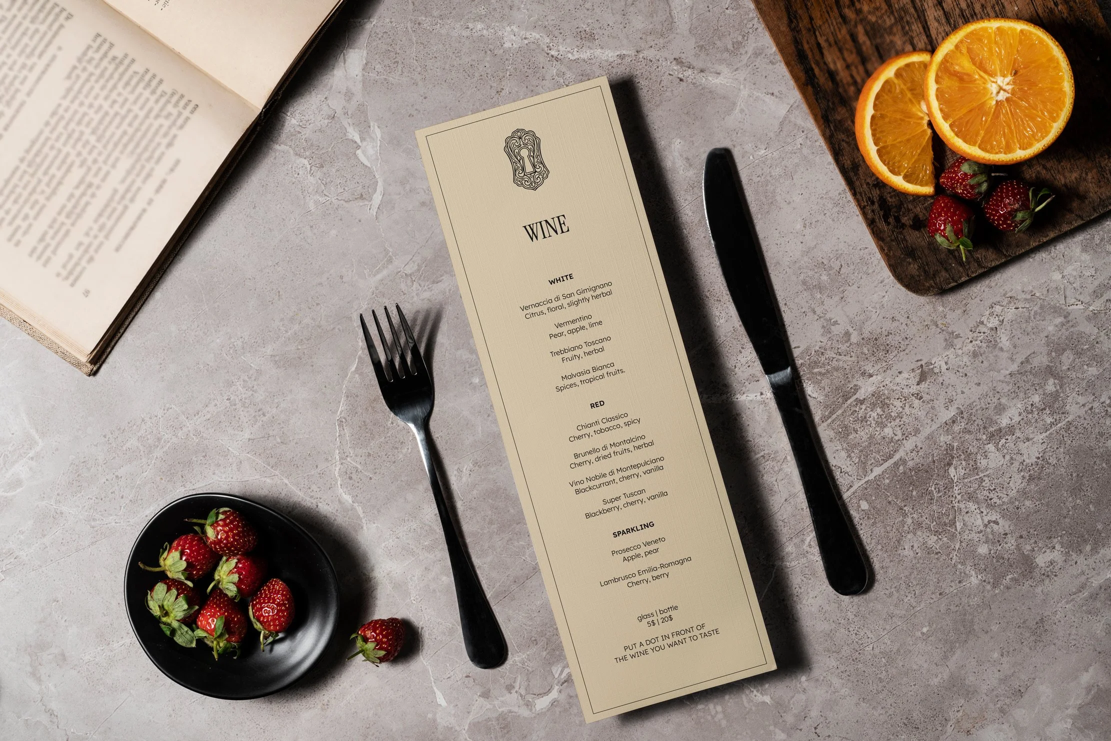
Typography System
TYPOGRAPHY STRATEGY & PHILOSOPHY
The typography of 1927 works in two registers. The first is identity — precise, composed, built to carry the name of the House with authority. The second is expression — warmer, more human, closer to the feeling of a handwritten note or a page from an old film programme.
Neither register exists alone. Together, they create the particular quality of 1927's voice: structured enough to command respect, alive enough to feel like somewhere worth belonging to.
Identity Typefaces are used across all formal brand communications — signage, headings, membership materials, and anywhere the House is presenting itself with full intention.
Expression Typefaces are used to introduce warmth, personality, and the feeling of craft — in handwritten member names, pull quotes, event invitations, and any moment where the brand speaks directly, personally, and with feeling.
Communication Touchpoints
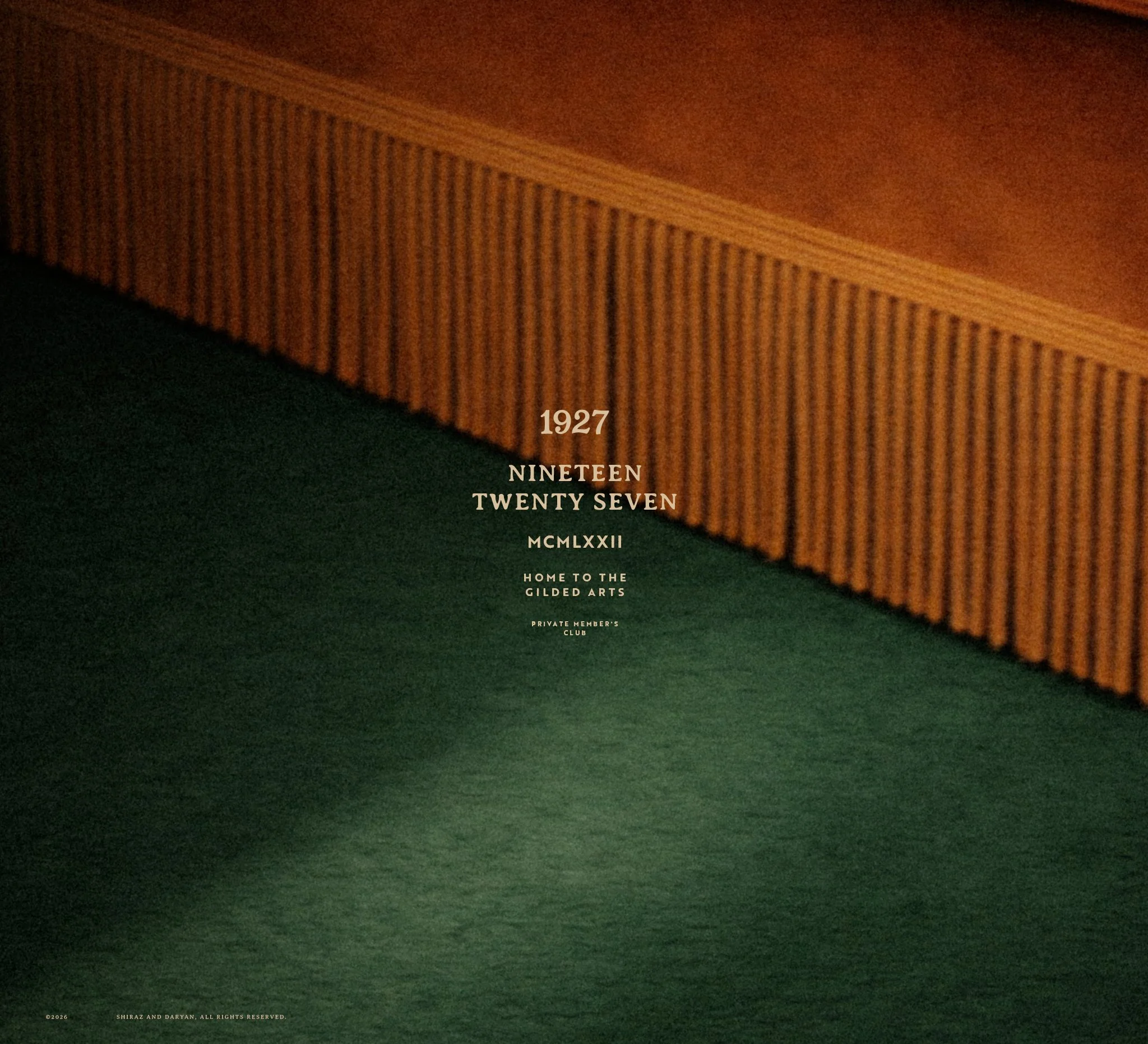
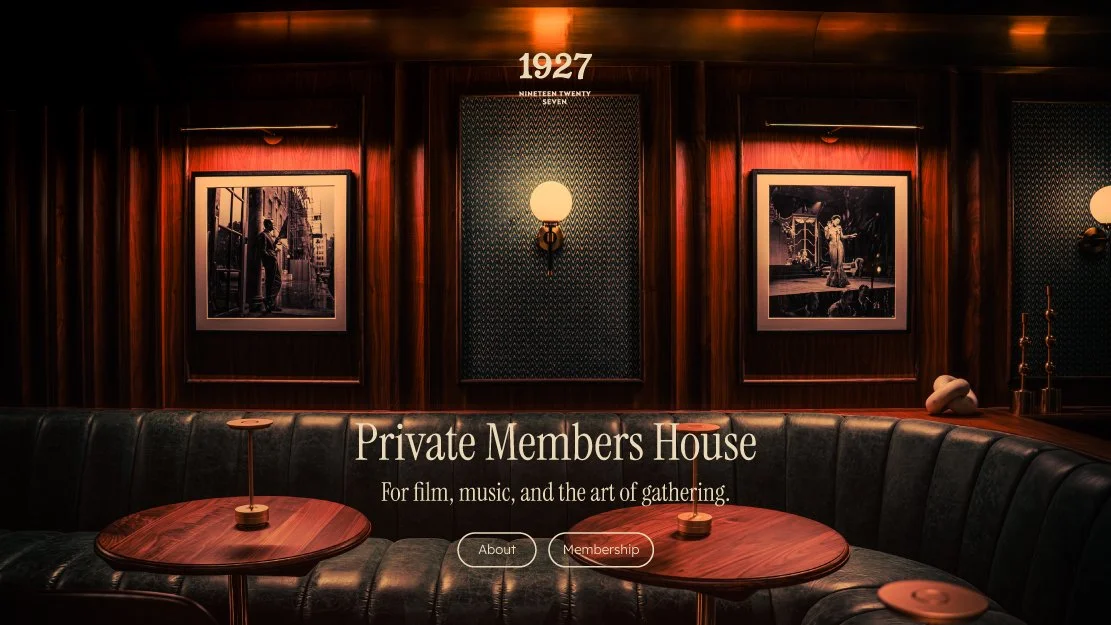
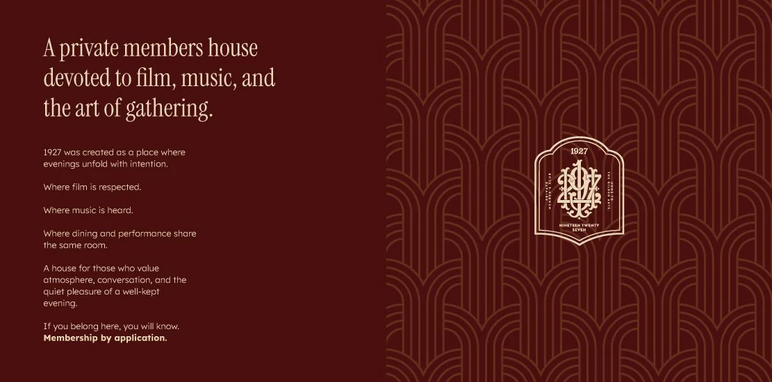
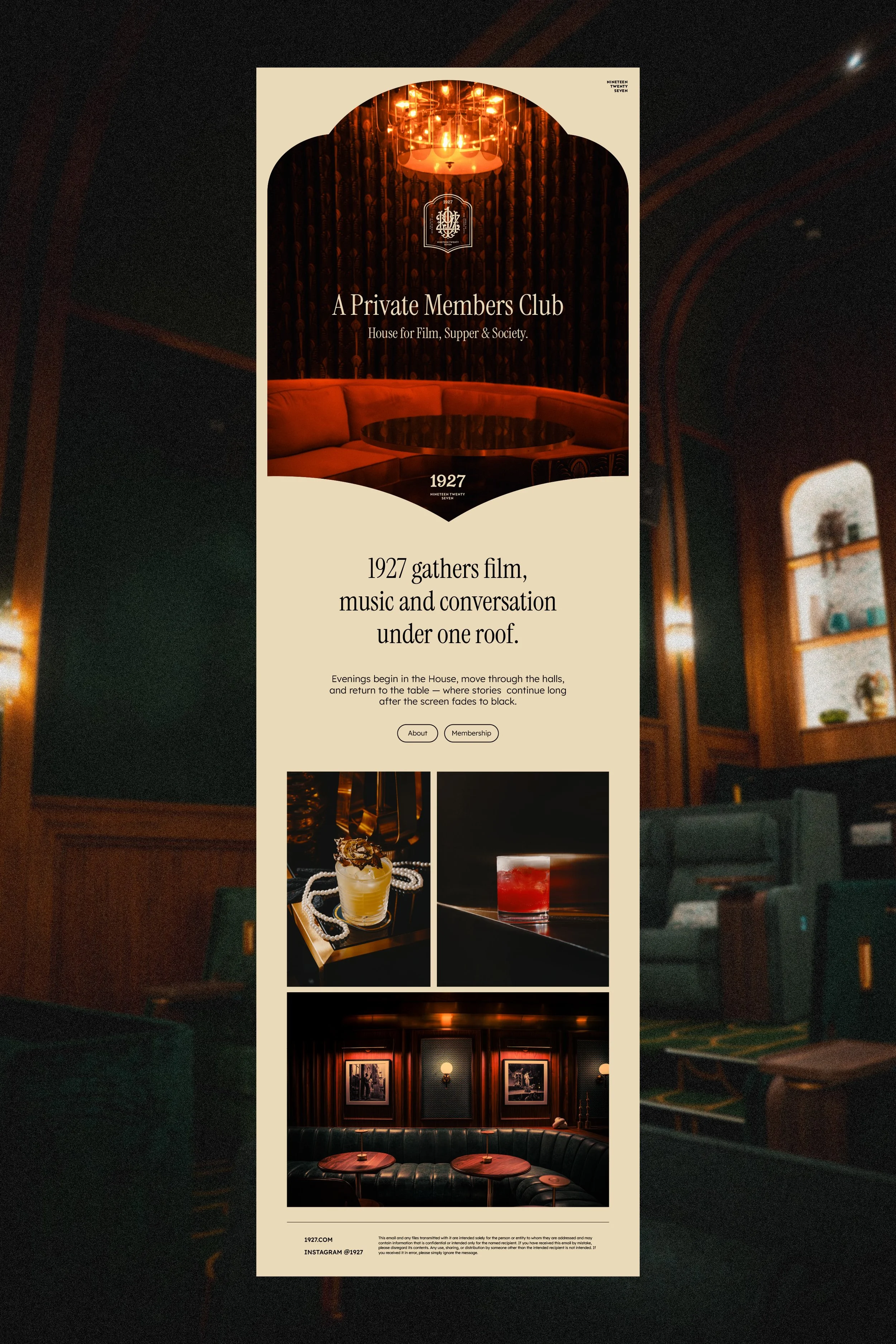
WEBSITE APPLICATION
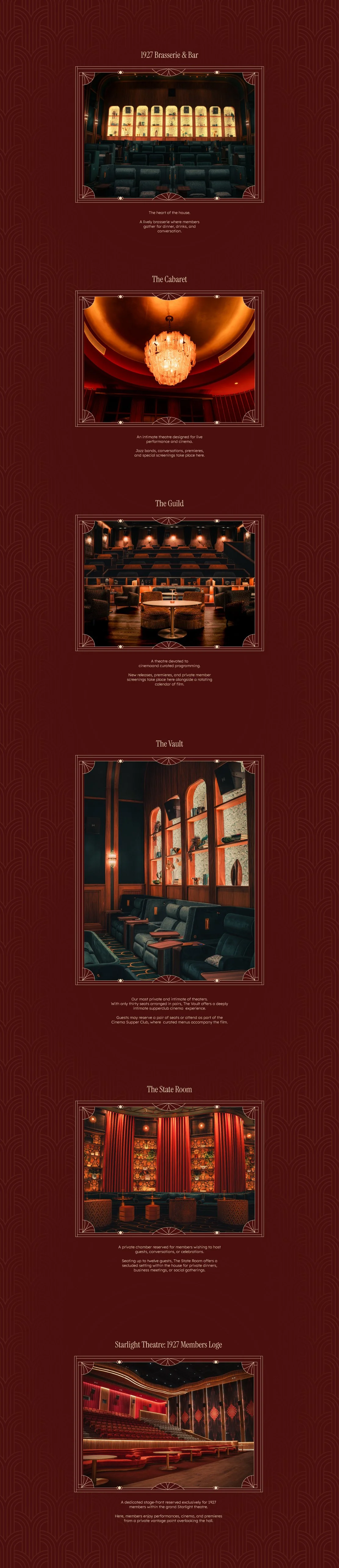
The 1927 website is not a brochure. It is an entrance. The design philosophy places atmosphere before information — the visitor should feel something before they read anything.
Photography carries the story. Typography gives it structure. The brand identity operates as a quiet frame around the content, never competing with the rooms, the light, or the people inside them.
Design Principles:
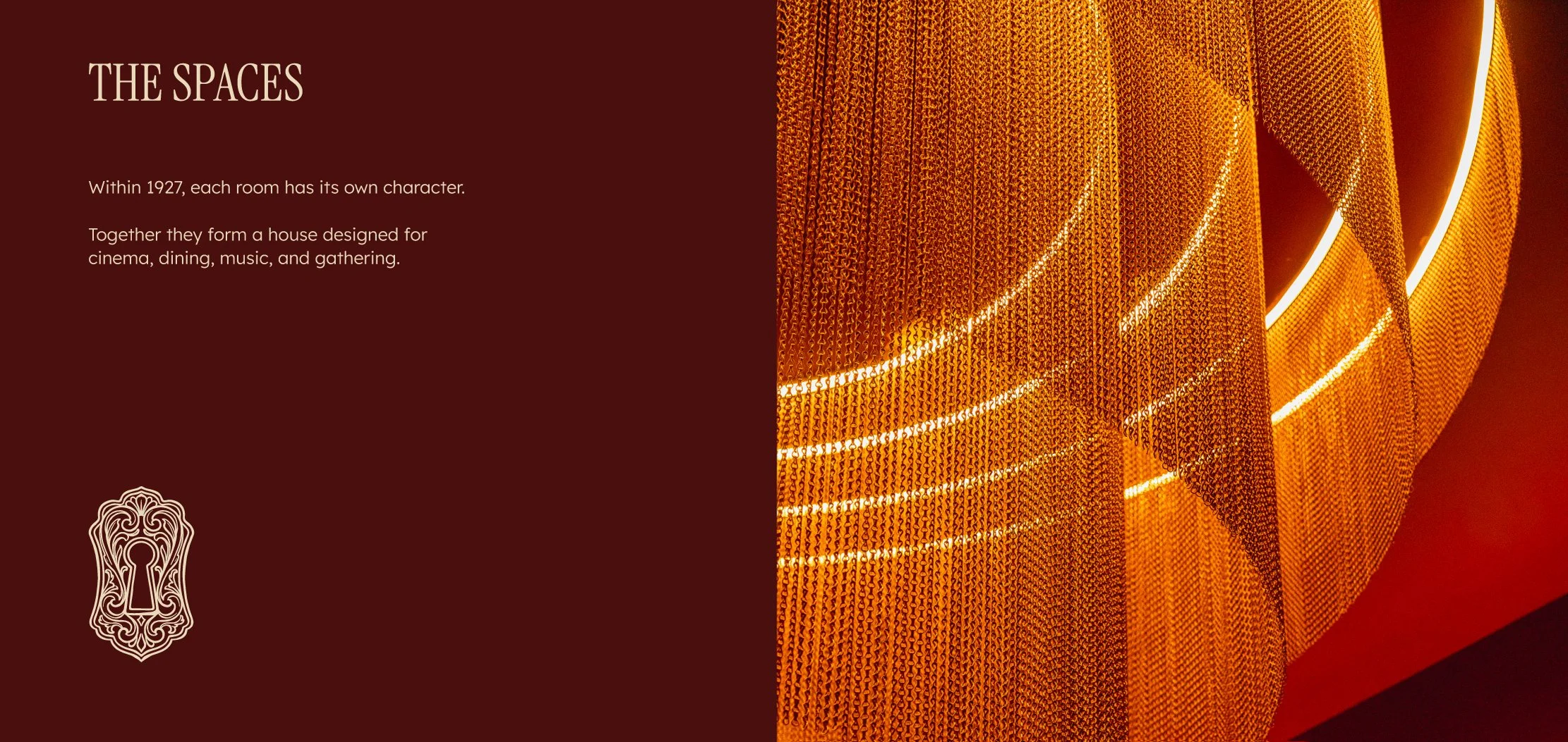
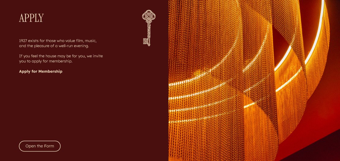
Photography leads. Every section opens with imagery that places the visitor inside the House — the warmth of the Brasserie, the intimacy of the Cabaret, the depth of the screening rooms.
Colour is used with discipline. The deep burgundy ground, the cream type, the gold ornament — these are applied to create atmosphere, not decoration.
Typography creates hierarchy without noise. Headlines arrive with weight. Body copy is legible and unhurried. Nothing fights for attention.
The brand pattern lives in the background — present as texture, never as wallpaper.
BUSINESS CARD
COASTER
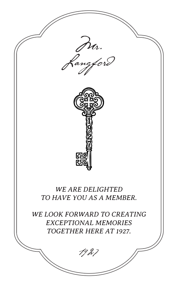
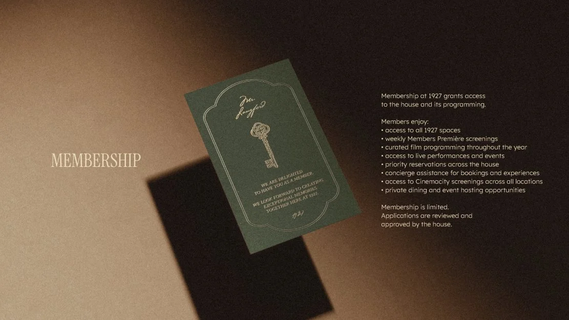
MEMBERSHIP CARD
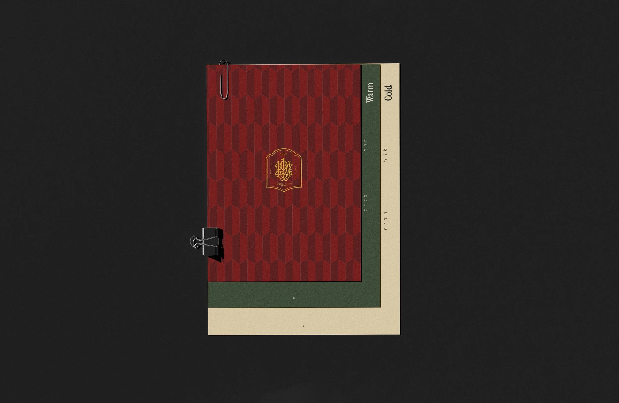
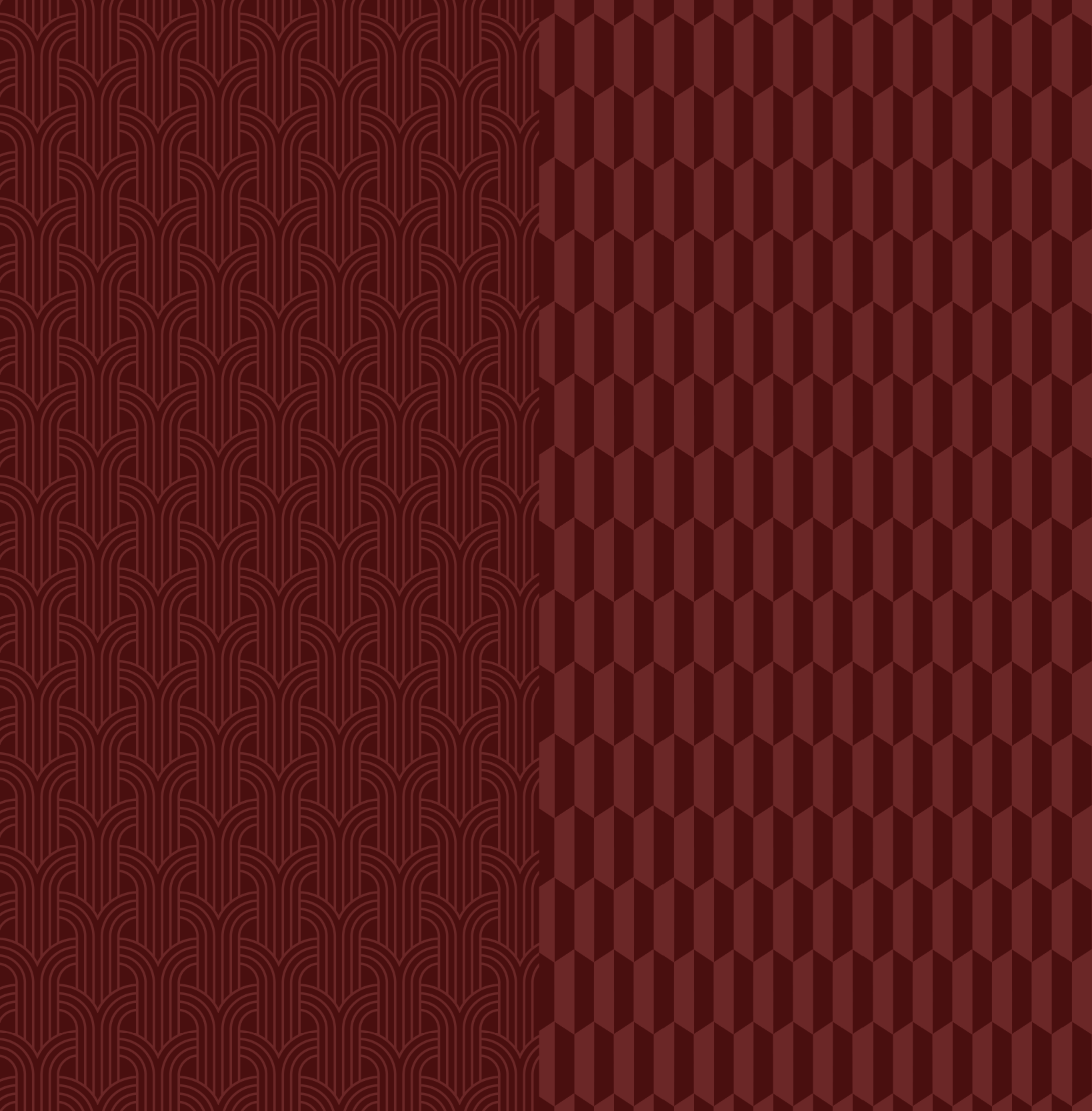
PATTERN