
Brand Guidelines
Crafting comfort through consistency.
Your guide to the softer side of Brooklyn.
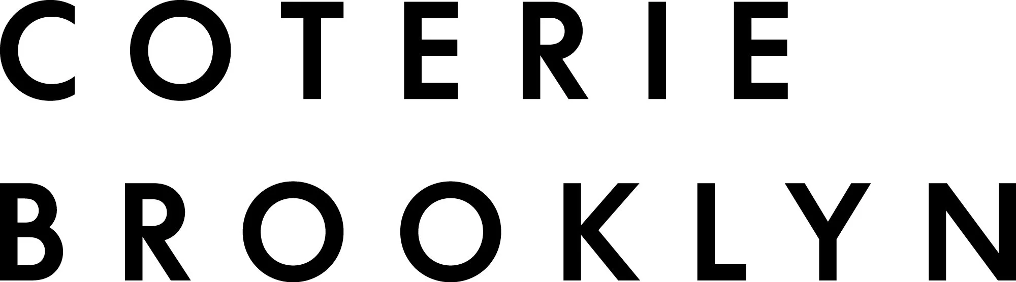
Coterie Brooklyn
Contents
COTERIE BROOKLYN BRAND GUIDELINES
Welcome to the Coterie Brooklyn brand guidelines and graphic standards. This comprehensive document provides all the essential elements needed to maintain consistency and professionalism across our brand communications. Whether you're part of our internal team or an external partner, these guidelines will help you understand and correctly implement our brand identity.
Within these sections, you'll find detailed specifications for our visual identity system, which has been thoughtfully designed to reflect our commitment to quality, minimalist aesthetics, and timeless design. These guidelines ensure our brand maintains its refined and trustworthy presence across all touchpoints.
Coterie Brooklyn's brand system represents the evolution of our eight-year journey in crafting premium home goods. Our identity balances professional sophistication with approachable warmth, much like the products we create. Each element has been carefully considered to communicate our core values: quality, craftsmanship, and attention to detail.

Logo
PRIMARY LOGO
Our primary logo consists of three key elements: the feather symbol representing softness and comfort, the "COTERIE BROOKLYN" wordmark in our custom typography, and our establishment date.
This combination reflects our commitment to quality, minimalist design, and our Brooklyn heritage. When using the logo, ensure all elements remain clear and legible.
LOGO USAGE INSTRUCTIONS
CLEARSPACE
To maintain the logo's visual impact and legibility, always maintain minimum clear space around it.
This protected area should be equal to the height of the lowercase 'o' in our wordmark.
This spacing rule applies to all edges of the logo lockup, ensuring it stands out clearly in any application.

SCALING
To preserve the integrity and legibility of our logo, never reproduce it smaller than 35mm in height.
This minimum size requirement ensures that all elements of the logo remain clear and recognizable across all applications.
The feather symbol and text must always remain proportional when scaling.

SEAL
Our brand seal serves as a mark of authenticity and craftsmanship. It incorporates Brooklyn-inspired architectural elements, our signature feather, and decorative clouds, all contained within a circular border.
The seal should be used selectively for special applications, packaging, and ceremonial purposes where we want to emphasize our heritage and attention to detail.

LOGO VARIATIONS
The Coterie Brooklyn logo has been designed to work across various applications.
The primary version includes all elements in their default arrangement, while secondary versions may be used when space or application constraints require alternative layouts.
All variations maintain our brand's sophisticated and minimalist aesthetic.


SYMBOL
Our feather symbol represents the essence of Coterie Brooklyn - softness, comfort, and refined craftsmanship.
This distinctive mark should maintain its integrity across all applications.
When using the symbol independently of the wordmark, ensure adequate clearspace to preserve its visual impact.

Color
Color Names
Our brand colors reflect our commitment to timeless, sophisticated design while echoing the natural elements found in our products. The palette consists of:
Pine Green - A deep, grounding tone that embodies our connection to nature and timeless design Midnight Indigo - A rich, sophisticated hue that adds depth and authority Eggshell - A warm neutral that provides balance and versatility
Each color has been carefully selected to work harmoniously with our product collections and create a cohesive brand presence across all touchpoints.
Pine Green
HEX
RGB
CMYK
283939
40 57 57
78 59 62 54
Eggshell
HEX
RGB
CMYK
F1E7D6
241 231 214
5 7 15 0
Midnight Indigo
HEX
RGB
CMYK
1C304F
28 48 79
95 82 42 38
COLOUR PAIRING
To maintain visual consistency across our communications, we use four distinct color combinations.
These pairings ensure optimal contrast and readability while reinforcing our brand identity.
Always use these prescribed combinations when creating core communications materials to maintain brand cohesion.
Typography
USAGE
Our typography system employs two complementary typefaces:
Shippori Mincho B1 - Our primary display typeface, used for headlines and key messaging. Its refined serifs and balanced proportions reflect our attention to detail and craftsmanship.
Figtree - Our supporting typeface, used for body copy and functional information. Its clean lines and excellent legibility make it perfect for digital and print applications.
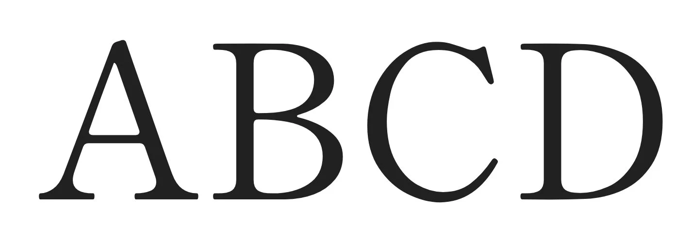
Shippori Mincho B1
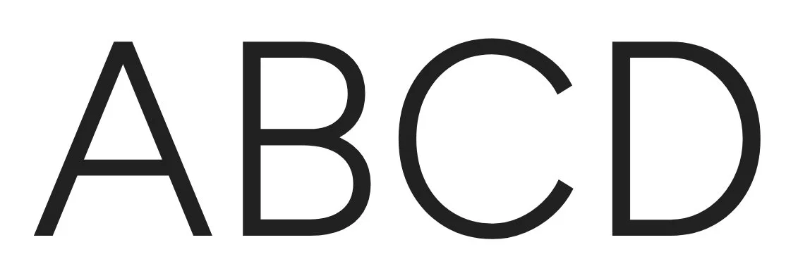
Figtree
Pattern
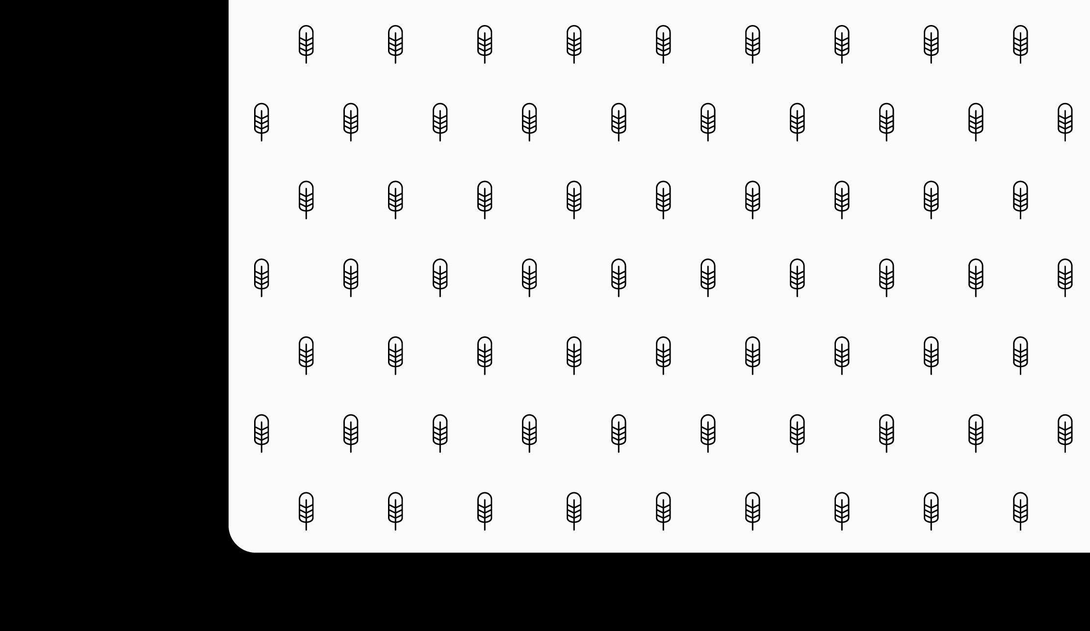
PATTERN
Our feather pattern provides a subtle yet distinctive decorative element for brand applications.
This repeating motif can be used as a background element or accent detail, adding depth and sophistication to our communications while maintaining our minimalist aesthetic.

Photography
Product Photography
Our product photography should maintain a clean, minimalist aesthetic that emphasizes texture and detail. Primary product shots require:
Consistent light gray or white backgrounds for e-commerce platforms
Sharp focus on product details and materials
Natural, even lighting to accurately represent colors
Multiple angles showcasing product features


Human Element
Include thoughtful human interaction with our products to create emotional connection:
Subtle hand interactions showing scale and texture
Natural, unposed moments
Focus on product interaction rather than faces
Diversity in representation
Lifestyle moments that resonate with our design-conscious audience


Lifestyle Photography
Lifestyle imagery should feel authentic and aspirational while highlighting our products in real spaces:
Clean, well-styled interior settings
Natural lighting whenever possible
Thoughtful product placement within the scene
Focus on texture and material interaction
Neutral, calming color palettes that complement our brand colors


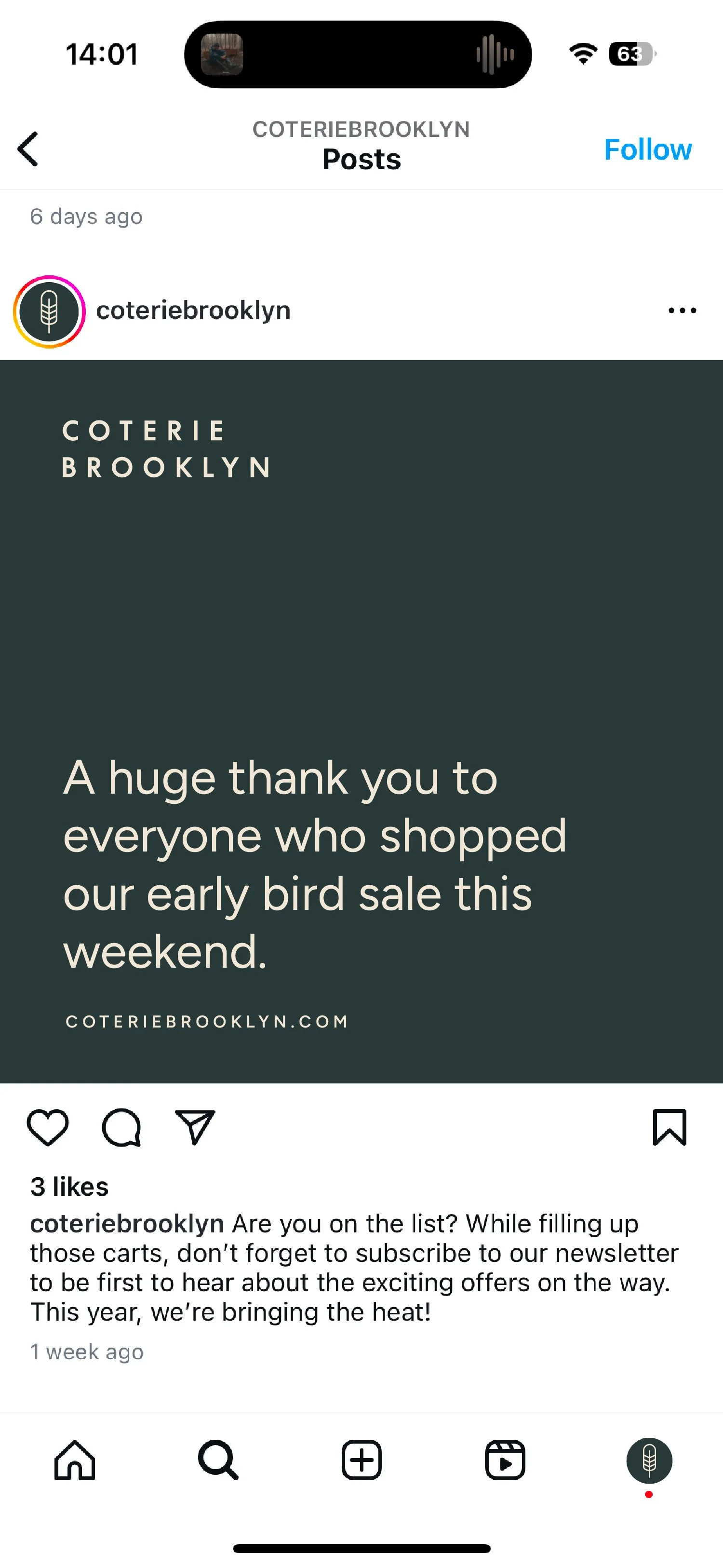
Digital Deliverables
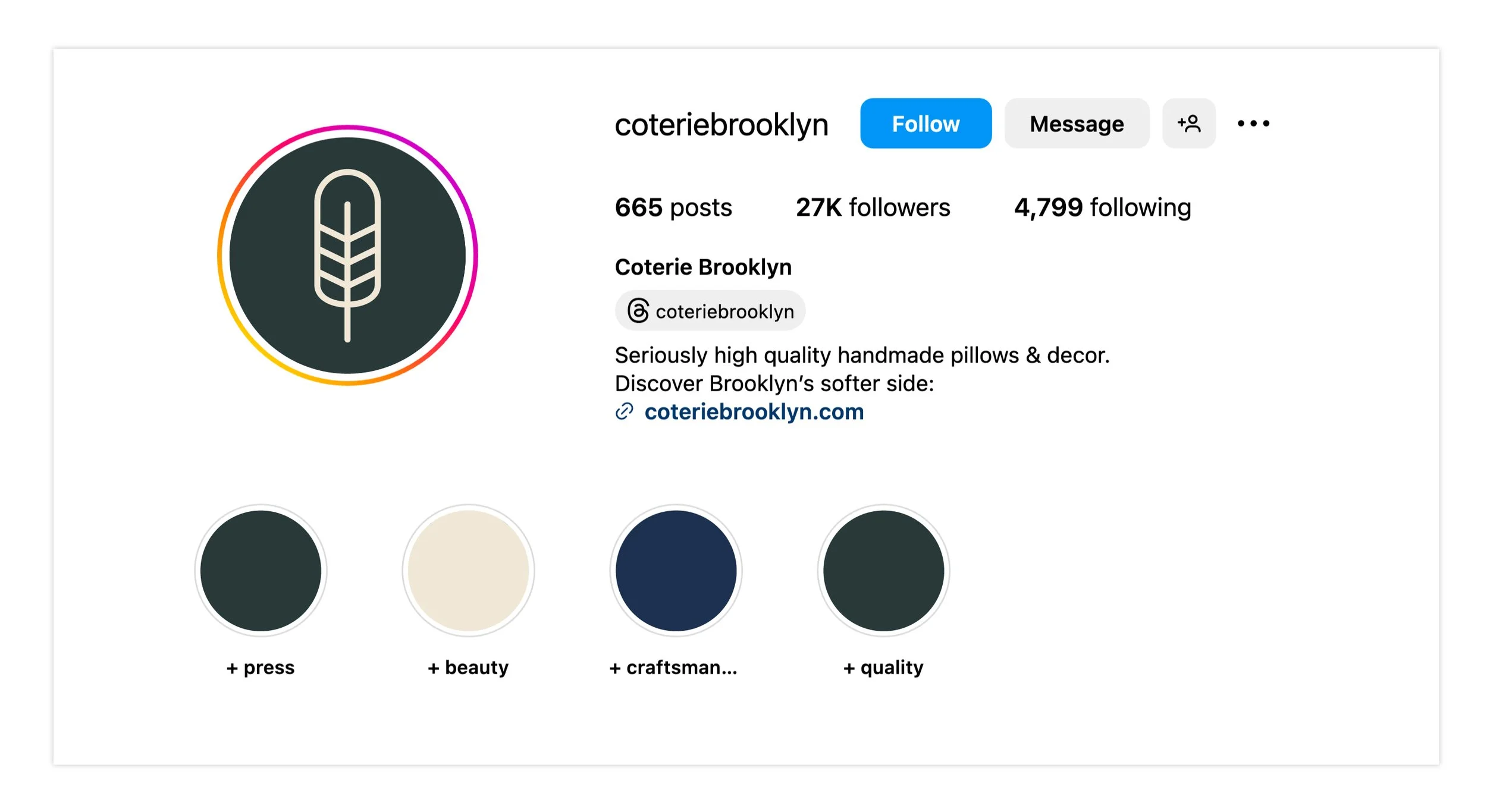
SOCIALS ICON
Our feather symbol serves as our social media avatar across all platforms.
The icon consists of our distinctive feather mark set within a circular container using our Pine Green background with Eggshell symbol.
When using the social icon:
Maintain minimum clear space around all edges
Never modify the symbol or its colors
Ensure the feather remains crisp and legible at all sizes
Use only approved color combinations

ACCOUNT VISUAL
TEXT ONLY


TEXT ON IMAGE


PERFORMANCE ADS
SOCIAL MEDIA STANDARD AD

NEWSLETTER

NEWSLETTER
EMAIL SIGNATURE

EMAIL SIGNATURE