Brand Guidelines
Shiraz & Daryan for Tequila Jack’s
TEQUILA JACK’S
Contents
TEQUILA JACK’S BRAND GUIDELINES
This document is the complete reference for the Tequila Jack's brand identity. It captures every confirmed decision — from the visual logic behind the skull icon to the color combinations that maintain brand authority across every touchpoint.
Logo Family
MAIN LOGO
Our primary logo brings together two elements that define the brand: the intricate skull icon — rooted in the authentic pirate heritage of Roatán's Bay Islands — and the "TEQUILA JACK'S" wordmark set in bold, commanding typography.
Together they strike the balance we've built everything around: laid-back in spirit, sophisticated in execution. The skull carries history and character without tipping into costume. The wordmark holds its ground with confidence and clarity.
When using the full logo, ensure the skull and wordmark maintain their proportional relationship and remain legible at all applications. This is the version to reach for when full brand impact matters.
LOGO USAGE INSTRUCTIONS
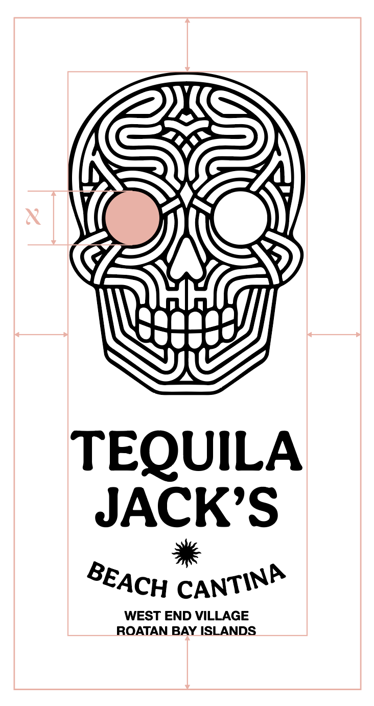
CLEARSPACE
To maintain the logo's visual impact and legibility, always maintain minimum clear space around it.
The logo requires breathing room equivalent to the diameter of the eye of the skull. This ensures the mark maintains its impact and readability across all applications.
This spacing rule applies to all edges of the logo lockup, ensuring it stands out clearly in any application.
LOGOTYPE
The "TEQUILA JACK'S" wordmark uses a custom type treatment with wide-tracked, bold letterforms that command attention without aggression. "BEACH CANTINA" follows in a complementary arched style — grounded, character-rich, and evocative of the location itself. Location text ("WEST END VILLAGE / ROATAN BAY ISLANDS") appears in tight, restrained caps — a quiet nod to place and provenance.
Use the logotype in contexts where the skull icon is already present, where space is limited, or when brand recognition is already established.

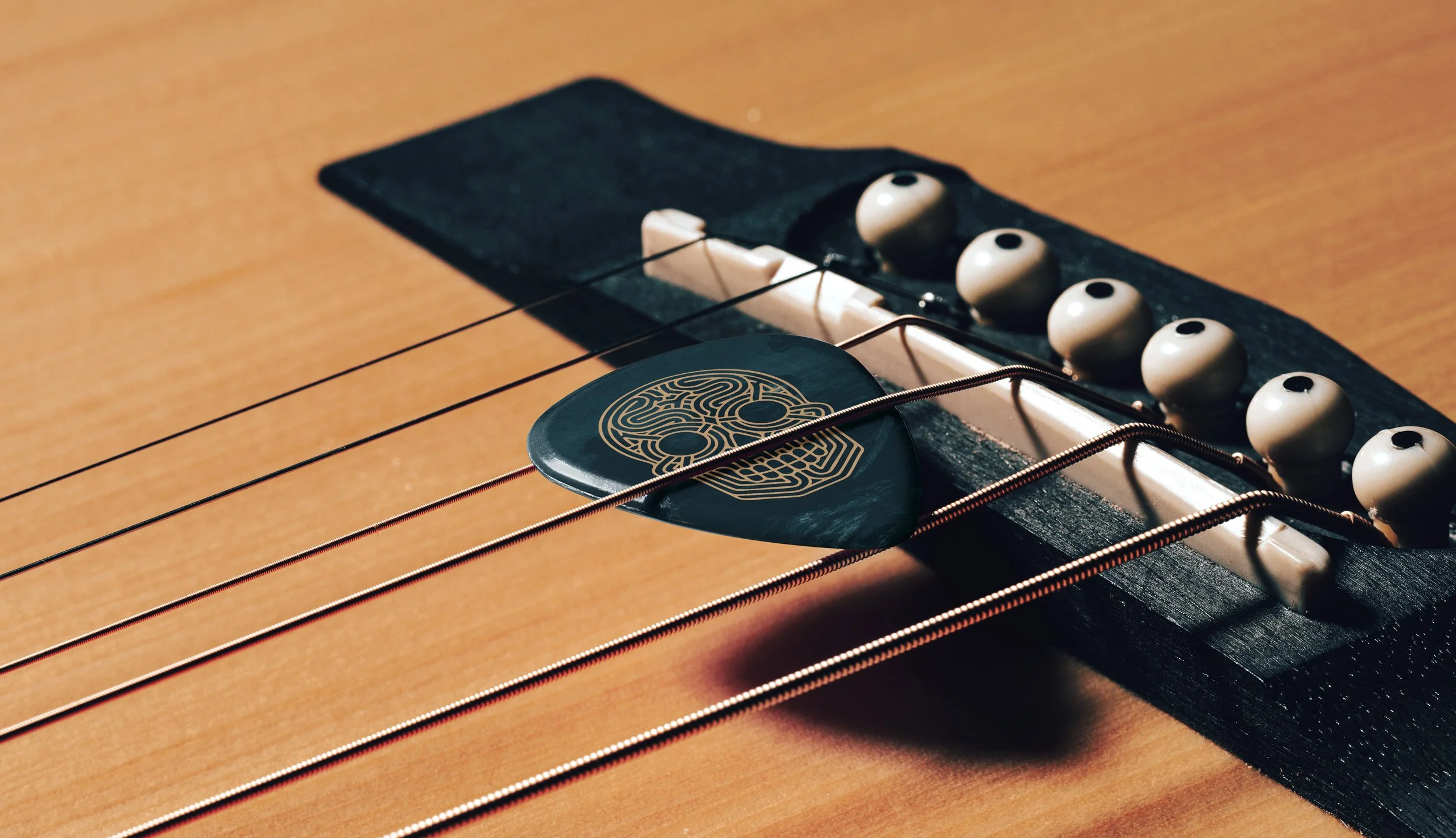
ICON - SKULL
The skull icon can stand alone when the full wordmark is impractical or where the brand is already known. It carries the same weight and character as the complete logo — refined enough for premium contexts, bold enough for merchandise.
Primary uses: social media profile images, favicon and app icons, merchandise where space is limited, watermarks and subtle brand presence.

ICON
SUN & SHIP

LOGO VARIATIONS
Horizontal Wordmark: Single-line configuration of "TEQUILA JACK'S" for applications requiring a wide, compact presence. Ideal for document headers, email signatures, digital interfaces, and any horizontal layout where vertical space is limited.
Full Wordmark: The complete left-aligned brand expression including "BEACH CANTINA" and location text. Use for primary brand communications, packaging, menus, and contexts where the full identity hierarchy adds meaning and place — particularly valuable for the airport location where provenance matters to travelers encountering the brand for the first time.
Compact Wordmark: Streamlined left-aligned version carrying the name only, without descriptor or location. Use when the context already establishes brand recognition, or when surrounding elements make the full hierarchy unnecessary. Clean, versatile, and works well alongside the skull icon.


Color System
COLOR STRATEGY & PHILOSOPHY
This color system embodies our "Laid-Back Sophistication" positioning - moving decisively away from bright tourist-trap Caribbean colors toward a refined, masculine palette that honors authentic pirate heritage while appealing to premium-seeking North American travelers.
Core Principle: Create sophisticated island authenticity that differentiates from cartoon pirate competitors (Christy's Overlook, Booty Bark, Captain Jack) while maintaining approachable beach cantina warmth.
Primary Palette (80-90% Usage)
Ivory (#F4EDE4)
Strategic Role: Sophistication foundation, natural warmth
Typography on dark backgrounds
Menu interiors and content areas
Natural material references (aged parchment, rope, canvas)
Never used as logo background - maintains premium positioning
Sand (#9CAB82)
Strategic Role: Refined earth tone, craft authenticity
Balanced accent color between warm and cool
Environmental graphics and natural elements
Packaging interior panels
Secondary brand applications
Charcoal (#222224)
Strategic Role: Premium anchor, masculine strength
Primary logo backgrounds
Headlines and key typography
Call-to-action elements
Core brand authority
Steel Blue (#36405A)
Strategic Role: Sophisticated ocean connection, trust
Main brand applications and signage
Digital primary backgrounds
Primary logo backgrounds
Ocean heritage without cartoon association
Extended Palette (10-20% Usage)
Clay Pink (#E3B1A6)
Strategic Role: Sunset warmth, approachable accent
Seasonal applications and gentle highlights
Community-focused marketing materials
Balances the masculine palette with warmth
Amber (#A65231)
Strategic Role: Heritage storytelling, craft premium
Premium product highlighting (special rums, craft cocktails)
Historical elements and aged material effects
Graphic details and heritage narratives
Leather goods and premium merchandise accents
Application Rules (Color Interaction Circles)
The circular matrix shows approved color combinations that maintain readability and brand sophistication:
Approved High-Contrast Combinations:
Charcoal + Ivory: Maximum readability, premium positioning
Steel Blue + Ivory: Ocean sophistication with clarity
Amber + Ivory: Heritage warmth with legibility
Clay Pink + Charcoal: Balanced warmth with strength
Prohibited Combinations:
Charcoal + Steel Blue: Insufficient contrast, muddy appearance
Sand + Clay Pink: Too similar in tone, lacks hierarchy
Any light colors as logo backgrounds: Compromises brand authority
Strategic Rationale:
Each combination serves specific brand functions - premium combinations (charcoal/ivory) for high-impact applications, balanced combinations (steel blue/ivory) for primary communications, and accent combinations (amber/charcoal) for special storytelling elements.
Gradient System
The gradient transitions demonstrate how colors flow naturally together for sophisticated applications:
Primary Gradients:
Ivory to Sand: Natural, organic transitions for packaging
Charcoal to Steel Blue: Sophisticated depth for digital applications
Secondary Gradients:
Clay Pink to Amber: Sunset warmth for seasonal content
Provide sophisticated alternatives to flat color applications
Typography System
TYPOGRAPHY STRATEGY & PHILOSOPHY
Our typography system is built for two things: character and clarity. Every font choice reflects the Tequila Jack's duality — enough personality to feel like a place worth discovering, enough restraint to feel polished rather than chaotic.
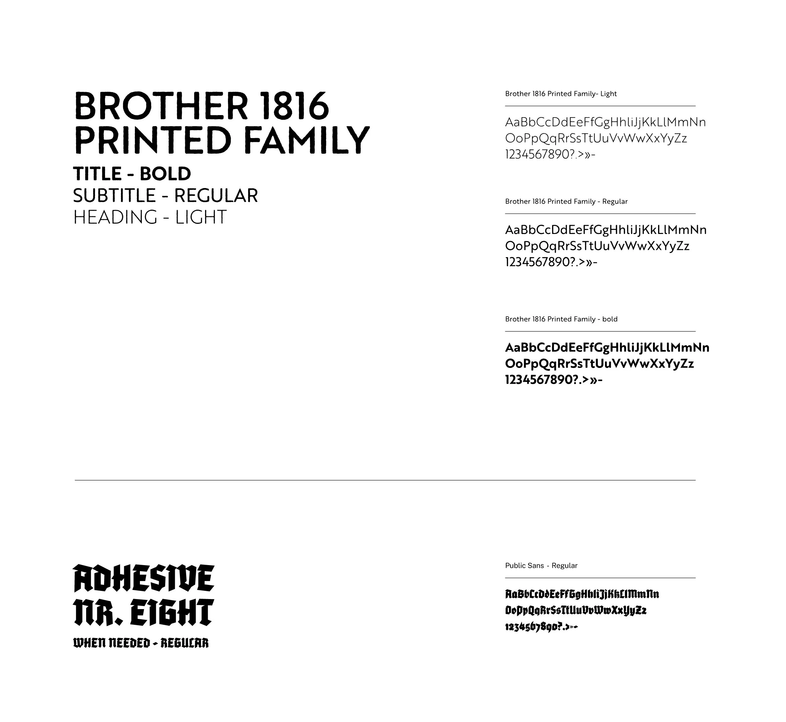
We use a two-font approach. Brother 1816 Printed Family handles the heavy lifting — headlines, titles, structural hierarchy — with its confident, slightly weathered geometric forms that feel both contemporary and heritage-aware. Adhesive Nr. Eight appears selectively for moments that need raw character: chalkboard-style callouts, specials, merchandise, and brand storytelling contexts where a handcrafted edge adds authenticity.
Brother 1816 Printed Family The primary workhorse of the system. Bold weight carries titles and primary headings. Regular handles subheadings, descriptive text, and secondary information. Light is available for refined body applications. The slightly printed texture in the letterforms gives even functional text a sense of place — like something you'd find on a well-designed rum label or a vintage nautical chart.
Adhesive Nr. Eight Our character font. Use sparingly and intentionally — for menu callouts, social captions with personality, merchandise graphics, and moments where the brand needs to feel handmade and human. The contrast between this and Brother 1816 is what creates visual tension and interest. Don't overuse it or the effect is lost.