Brand Guidelines
From Production Precision to Strategic Storytelling
Teralon
Contents
TERALON BRAND GUIDELINES - WIP
This brand guidelines document represents our collaborative journey from initial concept through strategic refinement. It serves as both a record of our confirmed decisions and a workspace for sharing refinements based on our recent meeting.

Brand Foundation & Strategy
WHY THIS REBRAND
Teralon's rebrand emerged from a clear strategic imperative: the existing brand identity felt "stuck in the 2010s" with its blocky, sans-serif aesthetic that no longer reflected the company's evolution or market positioning. The previous brand was restrictive, offering limited flexibility across different mediums and contexts.
THE STRATEGIC SHIFT
From corporate and generic → To strategic service-oriented partners
From execution-focused → To strategy-led creative collaborators
From rigid digital aesthetic → To flexible system balancing digital precision with organic warmth
POSITIONING
This rebrand supports Teralon's repositioning as sophisticated production partners who integrate seamlessly with client teams, offering strategic depth alongside creative execution. The goal: attract clients who are already open to creative approaches, reducing the need for convincing and allowing focus on exceptional delivery.
Brand Values & Personality
CORE VALUES
Creativity - Fuels progress. It's what turns the ordinary into the worthwhile and memorable
Courage - Standing out takes courage. Lead and create with confidence
Excellence - The only standard. If it's worth doing, it's worth doing well
Service - Defines the experience. Meeting expectations is the baseline. Exceeding them through care, expertise, and attention is the real win
Consistency - Greatness once is luck. Greatness every time is proof. Consistency builds trust
KEY BEHAVIOURS
Be a true partner, not just a supplier - Challenge the brief when needed. Offer insight, expertise, and bold ideas that elevate the work beyond the obvious or easy route
Relentless pursuit of excellence - Push every project to its full potential. Refuse to settle for "good enough"
Create with respect for the brand and the audience - Break the corporate mould. Make work people want to watch. Always respect the viewer's intelligence
Build trust and lead with care - Own the workload with confidence. Make the process seamless and enjoyable for clients through a white-glove approach
Positioning Statement
Teralon is the strategic production partner for companies who want to speak in a more human way. We don't just execute briefs - we dig deeper into the "why" behind every project, ensuring creative decisions are rooted in strategic thinking. Our clients experience the confidence that comes from working with experts who lift their problems while keeping them involved in creating something extraordinary.
Voice & Tone
We speak with quiet confidence.
Refined, stylish, and assured without arrogance. Our words are precise and purposeful, chosen to inspire and engage while respecting the intelligence of our audience. We are warm yet authoritative, balancing creativity with clarity, and vision with pragmatism.
Core Tone Attributes:
Confident - speaks with assurance and authority without arrogance
Expert - grounded in knowledge and experience
Refined - polished and precise, every word chosen with care
Distinctive - recognisable, subtly sophisticated, stands apart from the generic
Understated - avoids shouting; lets quality speak for itself
Authentic - genuine, transparent, and true to our values
In Practice:
We avoid noise and filler, letting substance and expertise speak for themselves. Every message reflects our originality, our relentless pursuit of excellence, and our belief that great ideas deserve equally great execution.
Logo Evolution
The Teralon logo has evolved from static presence to dynamic action, reflecting our transformation from a traditional production service to a strategic creative partner. The new lion maintains a subtle nod to our heritage through the single dot - a reference to our name's origin ("tear along the dotted line") - while the forward-leaping pose embodies our progressive approach and leadership position in the industry.
Strategic Symbolism:
Dynamic Lion: Represents forward momentum, strategic confidence, and industry leadership
Single Dot: Honors our heritage while avoiding literal interpretation that could limit brand flexibility
Refined Typography: Custom letterforms with softened corners create modern sophistication without rigid corporate feeling
This evolution balances respect for our history with the bold positioning required for our elevated market presence.
Logo Family
MAIN LOGO
Our primary logo consists of two key elements: the dynamic lion symbol representing forward momentum and strategic confidence along with the single dot - a subtle nod to our heritage, the "TERALON" wordmark in our custom typography.
This combination reflects our evolution from static presence to dynamic action, balancing our history with our strategic future. When using the logo, ensure all elements remain clear and legible, with the lion and dot maintaining their proportional relationship.
Usage: The complete brand expression featuring centered alignment of lion symbol and logotype. Use for major brand communications, presentations, and when full brand impact is desired.

LOGO USAGE INSTRUCTIONS
CLEARSPACE
To maintain the logo's visual impact and legibility, always maintain minimum clear space around it.
The logo requires breathing room equivalent to 2x the height of the dot around all sides. This ensures the mark maintains its impact and readability across all applications.
This spacing rule applies to all edges of the logo lockup, ensuring it stands out clearly in any application.

SCALING
To preserve the integrity and legibility of our logo, never reproduce it smaller than 35mm in height.
This minimum size requirement ensures that all elements of the logo remain clear and recognizable across all applications.
The lion symbol and text must always remain proportional when scaling.

LOGOTYPE
The TERALON logotype uses custom typography designed specifically for our brand identity. The letterforms feature softened corners that create a modern, approachable feeling while maintaining the confident presence required for our professional positioning. The wider kerning creates a brave and standout appearance that commands attention without aggression.
Usage: Typography-focused version for text-heavy communications where the lion symbol might compete with other visual elements, or when brand recognition is already established.

ICON
The lion and dot icon can be used independently when the full wordmark would be impractical or when brand recognition is already established. The icon maintains the same dynamic energy and heritage reference as the complete logo.
Usage:
Social media profile images
Favicon and app icons
Merchandise applications where space is limited
Watermarks and subtle brand presence

LOGO VARIATIONS
Primary Logo (No Tagline): Clean version omitting the tagline for space-constrained applications or when simplicity is preferred. Ideal for business cards, email signatures, and technical applications.
Secondary Logo (with Tagline): Full brand expression including the "Speak More Human" tagline for initial brand launch and awareness building. This variation provides complete brand messaging in a single lockup, ideal for presentations, marketing materials, and brand introduction contexts. The tagline will be updated in the near future as the brand evolves and matures.
Horizontal Logo (Left-Aligned with Tagline): Left-aligned configuration optimized for horizontal layouts such as letterheads and wide-format applications where the tagline adds strategic context.
Horizontal Logo (Left-Aligned, No Tagline): Streamlined horizontal version for applications requiring compact presence while maintaining full brand expression. Perfect for document headers, presentation footers, and digital interfaces.


VINTAGE LOGO
This expressive logo variation combines our lion symbol with script typography, creating a vintage-inspired treatment for special applications that celebrate our creative heritage.
Strategic Application:
Premium merchandise and limited editions
Anniversary celebrations and special events
Creative team initiatives and internal culture pieces
Social media content that emphasizes our artistic character
Brand Protection Note: This distinctive treatment should be kept away from primary website presence and client-facing business communications to avoid brand dilution. Reserve for contexts where audiences already understand our core identity and can appreciate this creative expression.

ABBREVIATED LOGOTYPE (RESERVED FOR FUTURE USE)
The abbreviated "TRLN" logotype provides a compact alternative for future applications once stronger brand recognition is established.
This condensed version will be valuable for:
Merchandise and apparel applications
Social media and digital contexts
Space-constrained layouts
Implementation Note: This abbreviated version should not be used during the initial rebrand rollout. We recommend establishing full "TERALON" recognition before introducing this shortened variant.

LOGO TEXTURES (ARCHIVED FOR SPECIAL APPLICATIONS)
These artistic texture treatments represent creative explorations that push our visual identity into more expressive territories.
The textured variations include:
Linear pattern overlay creating movement and energy
Horizontal scan lines suggesting digital precision
Dot matrix pattern connecting to our heritage story
Strategic Reserve: These treatments are being preserved for future special applications such as:
Gallery exhibitions or artistic collaborations
Anniversary editions and milestone celebrations
Limited edition merchandise or collector items
These explorations demonstrate the logo's versatility while maintaining its core recognition. They should not be used in standard brand communications but reserved for moments where creative expression takes precedence.


Color System
COLOR STRATEGY & PHILOSOPHY
Our color system is built on intentional contrast and strategic balance. Drawing inspiration from successful brands like Starbucks and National Geographic, we distinguish between functional communications (using our cool primary palette) and expressive communications (incorporating warm secondary colors). This approach ensures our brand maintains professional consistency while offering flexibility for creative expression.
The Strategic Balance: Our primary brand colors are intentionally cool - reflecting our calm, collected, and confident nature. However, we balance this coolness with warm secondary colors that bring humanity and approachability to our communications. This mirrors our brand personality: technically precise yet organically warm, strategically focused yet creatively flexible.
Primary Colors - Functional Communications (60-70%)
Our primary palette forms the backbone of all professional communications, establishing trust and consistency across client touchpoints.
#4FCBCA - Accent Blue The lightest expression of our signature teal, used for highlights and interactive elements.
#3FA9B0 - Teralon Blue Our core brand color - a sophisticated teal that balances professional credibility with creative energy. This refined version of our heritage turquoise offers better versatility across applications.
#D2EDEF - Light Blue Subtle supporting tone for backgrounds and breathing space in layouts.
#F5F5F5 - Soft White Our preferred neutral, avoiding harsh pure white for a more sophisticated feel.
#002147 - Oxford Blue Deep, authoritative navy that grounds our palette and provides strong contrast.
#0D0D0D - Off Black Rich black with subtle warmth, avoiding stark digital harshness.
Secondary Colors - Expressive Communications (30-40%)
These warm colors counterbalance our cool primary palette, bringing organic character and emotional warmth to creative applications. They should always be used alongside brand colors, never in isolation.
Warm Spectrum:
#E9D8A6 - Sand Beige - Sophisticated neutral with vintage character
#FFD500 - Solar Yellow - Energetic accent for creative emphasis
#EE9B00 - Amber Orange - Confident warmth for dynamic applications
#CA6702 - Burnt Sienna - Rich, grounded tone for premium contexts
#BB3E03 - Brick Red - Bold accent for strategic emphasis
#9B2226 - Oxide Red - Deep, authoritative warm tone
#163527 - Deep Forest Green - Natural complement to our teal heritage
Color Weighting & Application Rules
For Information-Heavy Communications: Use 60-70% primary colors (cool palette) to maintain focus on content and ensure readability. Deploy secondary colors sparingly as accents.
For Creative & Lifestyle Communications:
Use 30-40% secondary colors (warm palette) to create emotional engagement, but always anchor with primary brand colors for consistency.
Strategic Guidelines:
Never use secondary colors alone - they must always be balanced with primary brand colors
Character comes from photography first, color second - let imagery carry warmth while graphics provide structure
Teralon Blue should appear in every multi-color application to maintain brand recognition
Use gradients sparingly - when needed, blend within the same color family (cool-to-cool or warm-to-warm)
Color Psychology & Messaging
Cool Primary Palette Communicates:
Professional expertise and reliability
Strategic thinking and clarity
Digital precision and modernity
Calm confidence and trustworthiness
Warm Secondary Palette Adds:
Human approachability and creativity
Organic authenticity and craft
Energy and forward momentum
Premium quality and sophistication
This dual approach allows us to speak the language of corporate professionalism when building trust, while expressing our creative character when inspiring action. The key is knowing when each voice is needed and never compromising brand recognition for creative expression.
Typography System
TYPOGRAPHY STRATEGY & PHILOSOPHY
Our typography system balances confident expression with practical readability, reflecting Teralon's dual nature as both strategically minded and creatively driven. We employ a two-font approach that creates visual interest in headlines while prioritizing clarity in body text.
Primary Typeface - Barlow Semi Condensed
Usage: Titles, Subtitles, and Headings
Character: Modern, confident, and distinctive
Barlow Semi Condensed serves as our primary display typeface, chosen for its contemporary feel and excellent versatility. The semi-condensed width creates efficient use of space while maintaining excellent readability. Its geometric construction with humanist touches aligns with our balance of digital precision and organic warmth.
Available Weights:
Regular - Standard headings and navigation
Medium - Emphasized headings and important callouts
Bold - Primary titles and strong emphasis
Why Barlow Semi Condensed:
Creates distinctive character that stands apart from standard corporate fonts
Condensed width works excellently for vertical formats and mobile applications
Multiple weights provide hierarchical flexibility
Strong personality without sacrificing professionalism
Excellent web performance and Google Fonts availability
Supporting Typeface - Public Sans
Usage: Body text, captions, and detailed information
Character: Clean, readable, and trustworthy
Public Sans handles all body text and extended reading scenarios. Designed by the U.S. Digital Service, it offers exceptional clarity and accessibility across all platforms and devices. Its neutral character ensures our content remains the focus while supporting the brand's professional credibility.
Available Weights:
Regular - Standard body text and descriptions
Medium - Emphasized body text and important details
Bold - Strong emphasis within body content
Why Public Sans:
Optimized for digital readability across all screen sizes
Excellent accessibility features for inclusive design
Neutral character doesn't compete with display typography
Reliable web performance and broad device support
Typography Hierarchy & Scale
Our type scale is designed to create clear information hierarchy while maintaining visual harmony across all applications.
Title: 4rem (64px) / 40pt - Barlow Semi Condensed Bold Use for hero sections, major announcements, cover pages
Subtitle: 2.6rem (41.6px) / 26pt - Barlow Semi Condensed Medium
Use for section headers, key messaging, chapter titles
Heading: 1.8rem (28.8px) / 18pt - Barlow Semi Condensed Medium Use for content sections, blog post titles, navigation
Body: 1.2rem (19.2px) / 12pt - Public Sans Regular Use for paragraphs, descriptions, detailed information
Digital Applications
Google Slides Optimized Sizes:
Title: 54pt - For slide headers and key messaging
Subtitle: 25.5pt - For section breaks and emphasis
Heading: 16pt - For content organization
Body: 8pt - For detailed information and footnotes
These sizes are specifically calibrated for optimal readability in presentation contexts and video calls.
Typography Best Practices
Hierarchy Rules:
Use maximum 3 type sizes per page/slide for clarity
Maintain consistent weight relationships (Bold titles, Medium headings, Regular body)
Ensure adequate contrast between levels through both size and weight
Readability Guidelines:
Minimum body text size: 12pt print / 16px digital
Line height: 1.4-1.6 for body text, 1.2-1.3 for headings
Optimal line length: 45-75 characters for body text
Brand Expression:
Use Barlow Semi Condensed for any text meant to represent our voice and personality
Reserve Public Sans for content that prioritizes reader comprehension
Never use decorative or script fonts in primary communications (except vintage logo applications)
This typography system ensures our communications feel distinctively Teralon while maintaining the professional clarity our clients expect. The contrast between display and body fonts creates visual interest without sacrificing functionality.

Communication Touchpoints
WEBSITE APPLICATION
Our website design philosophy prioritizes content-driven storytelling driven by photography and supported by typography. The visual identity serves as a clean, sophisticated framework that allows our content and imagery to tell the story, while typography and minimal color application maintain professional credibility.
Design Principles:
Photography-led storytelling
Strategic use of black and white imagery for case studies to ensure consistency across diverse client projects
Color photography for brand content to introduce warmth and personality
Typography hierarchy that creates impact without overwhelming content
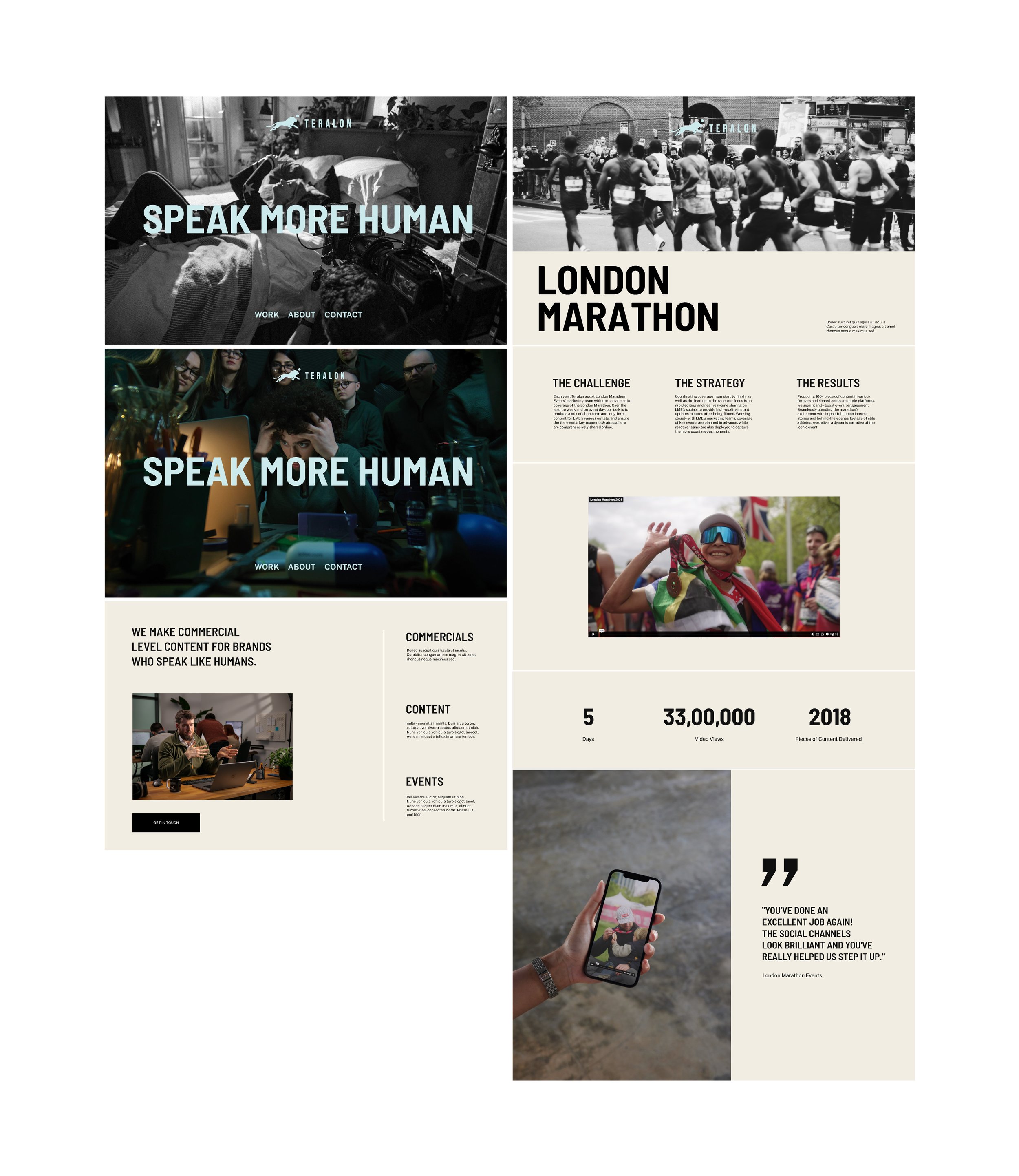
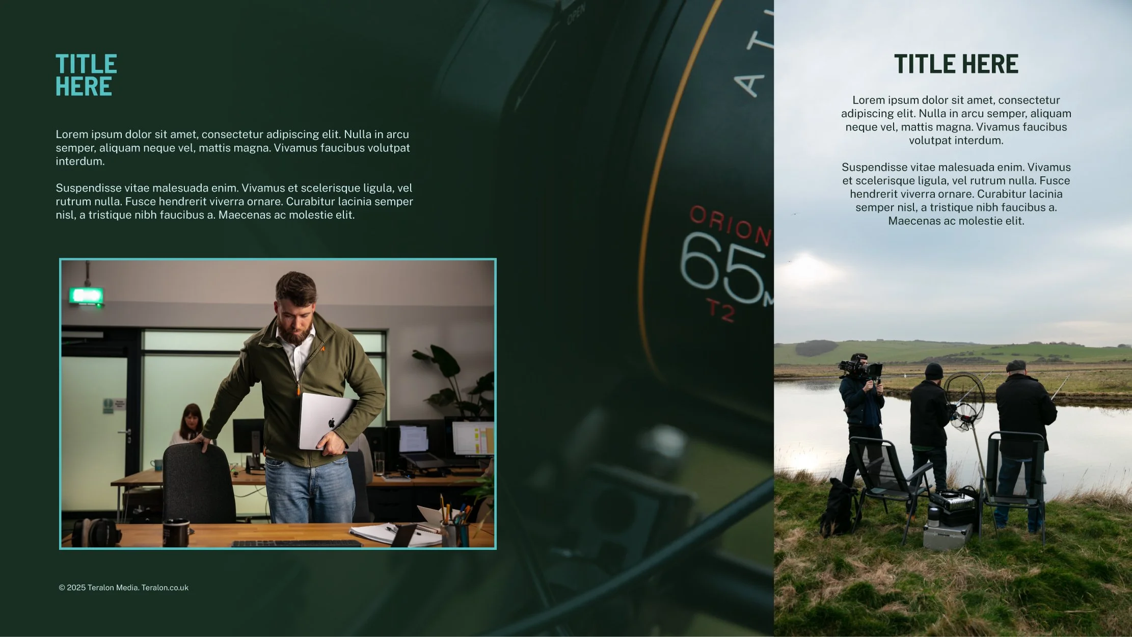
SLIDESHOW
Our presentation templates balance professional credibility with creative character, designed specifically for Google Slides to ensure accessibility across the team. The system prioritizes content clarity while expressing Teralon's sophisticated brand personality.
Design Principles:
Photography-driven layouts with strategic graphic support
Teralon Blue accents provide brand consistency without overwhelming content
Flexible image containers allow for both full-bleed and framed photography
Typography hierarchy ensures readability in video call contexts


Photography
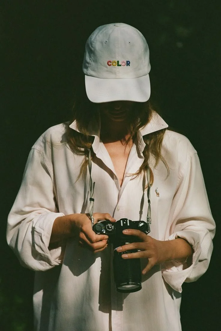
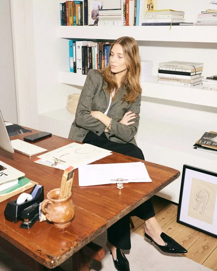
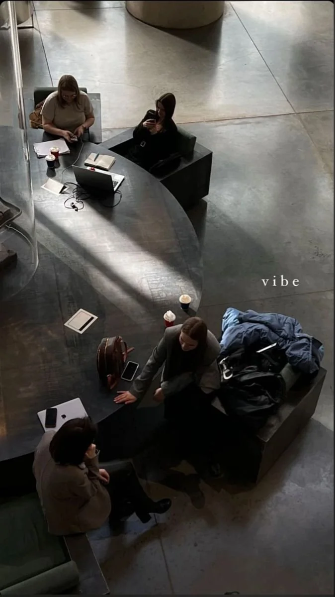
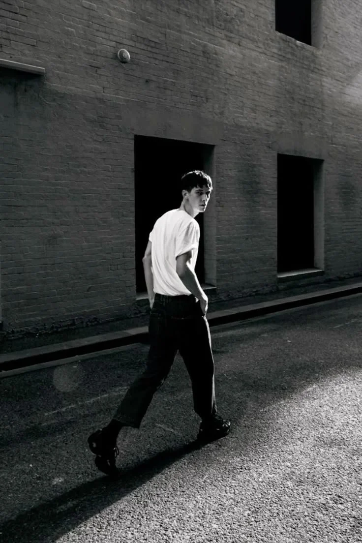
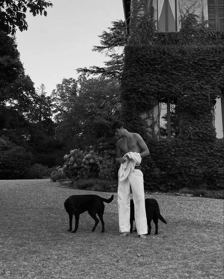
Photography Direction
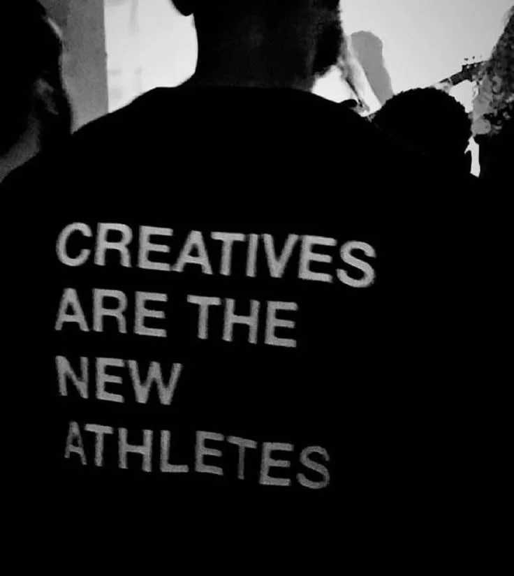
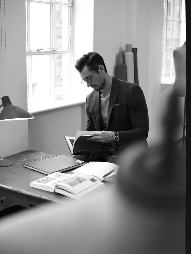
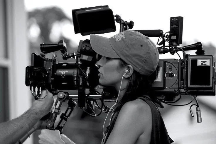
Creative Vision: "Creatives Are The New Athletes"
Our photography approach positions the Teralon team as creative heroes - skilled professionals at the peak of their craft. We capture the intensity, focus, and collaborative energy that defines modern creative work, elevating the perception of our industry and showcasing the strategic thinking behind every project.
Color Integration Strategy
Warm Brand Colors in Context: Subtly incorporate our secondary color palette through intentional styling and environmental choices rather than forced color placement.
Warm neutrals (sand beige, amber tones) through wardrobe choices and natural lighting
Organic oranges and reds via props, workspace details, and strategic styling
Natural lighting that creates warmth while maintaining professional quality
Environmental warmth through wood tones, plants, and carefully chosen backgrounds
Implementation Guidelines:
Let warm colors emerge naturally through styling and environment
Balance warm elements with our signature cool teal accents (equipment, branding)
Prioritize authentic moments over color-coordinated compositions
Use lighting to enhance warmth without sacrificing the cinematic quality
Visual Language & Mood
"Old Money Meets Cool Technical Creatives"
Sophisticated, understated elegance with contemporary edge
Natural confidence without arrogance
Technical precision balanced with organic humanity
Collaborative energy and strategic focus
Capture Approach:
Behind-the-scenes authenticity over posed portraits
Environmental storytelling showing work in context
Dynamic moments that reveal process and personality
Both intimate strategy sessions and energetic production moments


Strategic File Delivery Experience - WeTransfer
Our WeTransfer backgrounds transform a functional touchpoint into a brand experience that reinforces Teralon's positioning as cinematic storytellers and strategic creative partners. These applications showcase our work in action while maintaining professional credibility.

MERCH & UNIFORM CONCEPTS


EMAIL SIGNATURE
