First Revision
This presentation is optimized for desktop viewing.
Keywords
Balancing Strategy & Energy
The revised keyword list maintains the strategic foundation that builds trust while introducing more dynamic, creative terms that reflect the '90s-inspired aesthetic we're aiming for. Terms like "nimble," "innovative," "cinematic," and "culturally-aware" inject necessary creative vitality while complementing our established professional positioning. This vocabulary supports our dual approach of functional touchpoints with corporate credibility alongside expressive touchpoints where our vintage-modern aesthetic can truly shine.
Approach
Analytical
Insightful
Thoughtful
Strategic
Nimble
Progressive
Intentional
Innovative
Deliberate
Visionary
Service
Attentive
Seamless
Luxurious
Reliable
Elevating
Responsive
Anticipatory
Thorough
Curated
Bespoke
Character
Adaptable
Versatile
Dynamic
Balanced
Authentic
Confident
Creative
Culturally-aware
Energetic
Multifaceted
Aesthetic
Organic
Precise
Contemporary
Textured
Refined
Warm
Cinematic
Technical
Nostalgic
Tactile
Experience
Captivating
Involving
Effortless
Cohesive
Immersive
Reassuring
Exciting
Transformative
Memorable
Distinctive
Logo
Teralon Lion - Our Symbol
We've explored multiple creative directions for the Teralon lion, each bringing a unique balance of vintage character and contemporary relevance. (1) The textured version evokes traditional printing and adds warmth while maintaining professionalism. (2) Our line-based interpretation draws inspiration from classic corporate identities like AT&T but introduces dynamic contours that follow the lion's form, creating a sense of movement that's both nostalgic and sophisticated.
(3) The pattern variations offer particular versatility – these halftone and moiré treatments directly reference printing techniques from the '90s while creating visual interest that works across different scales. These patterns evoke vintage TV/film aesthetics, creating a natural connection to Teralon's industry while offering flexible application options.


Logo
Logotype system - Typographic Distinction
The logotype system offers both full and condensed versions, providing versatility for different applications while maintaining consistent brand recognition. The full “TERALON” logotype delivers maximum impact in horizontal formats, while the condensed “TRLN” version provides greater flexibility for vertical layouts, merchandise, and compact applications.
We selected this typography from our initial design explorations because it offers the most distinctive character. The slightly condensed proportions and geometric structure create a contemporary feel while the subtle adjustments to letter spacing provide unique personality. We intentionally chose not to use the logotype font in our typography system to ensure the uniqueness of the logotype, especially important since it’s a customized typeface. This separation creates clear distinction between Teralon’s identity elements and its communication system.
The condensed version simplifies the name to its essential elements without sacrificing recognition, creating an elegant solution for space-constrained contexts. Both versions work harmoniously within the broader brand system while providing clear practical options for different implementation requirements.
Logo
Camera Club Concept - Vintage Logo
An expressive secondary identity
Taking inspiration from your "Teralon Camera Club" reference, we've developed this secondary identity element that adds another dimension to your brand. This concept creates a perfect outlet for your more expressive applications while keeping your core brand identity contemporary and professional.
The script typography has character without being overly decorative, and the overall aesthetic references vintage photography clubs and film societies – creating authentic nostalgia without falling into the "trying too hard" territory you wanted to avoid. This secondary identity works beautifully for merchandise, special projects, and brand culture building content.
Logo
Logo system for Teralon - WIP
Primary Logo Elements
The Lion
Our distinctive lion symbol represents Teralon's strategic approach and forward momentum
The dotted elements reference our name origin ("tear along dotted line") and add unique character
The lion always faces right to convey progress and forward-thinking
The Wordmark
Custom typography with slightly condensed proportions provides a contemporary feel
Available in full ("TERALON") and condensed ("TRLN") formats for different applications
The wordmark should never be recreated using standard fonts - always use provided files
Logo Variations
Functional Applications
Primary Combination Mark
The lion with single dot + wordmark creates our standard identifier
Available in left-aligned and center-aligned compositions for different layouts
Use for: client presentations, website header, email signatures, business cards
This version balances professionalism with distinctive character
Wordmark Only
Clean, sophisticated presentation of the Teralon name
Use for: formal documents, contracts, official correspondence
Provides brand recognition in contexts where the icon is not needed
Icon Only
The lion symbol serves as our most compact identifier
Use for: social media avatars, video watermarks, small-scale applications
Maintains brand presence when space is limited
Expressive Applications
Vintage Badge Logo (tbc)
Rectangle-framed lion
Use for: crew merchandise, tote bags, promotional items
Perfect for contexts where a more vintage aesthetic is appropriate
Textured Lion (if applicable)
Rectangle-framed lion
Use for: crew merchandise, tote bags, promotional items
Perfect for contexts where a more vintage aesthetic is appropriate
Script Wordmark
Handwritten-style signature version of our name
Use for: special projects, culture-building content, premium materials
Adds warmth and personality for specific contexts
Application Guidelines
Choose the appropriate logo variation based on context
Client-facing materials generally use functional variations
Merchandise and crew materials can utilize expressive variations
Digital applications should consider both required size and audience
Maintain proper clearspace around all logo variations
Allow sufficient breathing room around the logo (minimum = height of "T")
Never crowd the logo with other elements or place near page edges
Use only approved color combinations
Primary palette: Black, Off-White, Oxford Blue, Tropical Teal (as accent)
Secondary palette: Warm Neutral, Vintage Orange (for expressive applications)
Ensure sufficient contrast between logo and background
Never modify or distort the logo
Do not stretch, condense, or rotate any logo variation
Do not change colors outside approved palette
Do not recreate or redraw logo elements
Color Strategy
Balancing functional precision with expressive warmth
The color system establishes a clear strategic framework divided between functional and expressive communications. Primary colors (blues, teals, black, white) dominate functional communications (60-70% of applications), creating a professional foundation that signals precision and expertise. These colors maintain Teralon's established brand recognition while adding sophistication through carefully calibrated teal variations (Accent Blue #4FC8CA, Tension Blue #3FA9BD, Light Blue #D2EDEF).
Secondary colors (warm yellows, oranges, reds) provide expressive counterpoints for merchandise and special applications (30-40% of applications). This warm palette connects directly to the vintage aesthetic we referenced while creating clear distinction from the core brand elements. The strategic balance between cool primary colors and warm secondary colors creates a system that can flex between corporate precision and creative expression while maintaining a cohesive identity.
The gradient framework provides additional flexibility for digital applications, creating depth and visual interest while maintaining color system integrity. This approach ensures Teralon's brand can adapt to different contexts while maintaining consistent recognition across all touchpoints.

Typography System
Building hierarchy through purposeful contrast
The typography system establishes clear hierarchical relationships through strategic font pairing and consistent proportions. Barlow Semi Condensed serves as the title typeface, with its condensed nature creating a modern, efficient aesthetic that signals precision while maximizing space efficiency. The geometric structure conveys technical expertise while maintaining high readability.
Public Sans provides complementary support for subtitles, headings, and body text, creating balanced contrast while maintaining system cohesion. This pairing ensures distinction between title elements and supporting content, creating immediate visual hierarchy without sacrificing readability across different contexts.
The main size guide demonstrates how these fonts work best in relation to each other in different placements, particularly for website applications. However, we acknowledge that for best results, there is a detailed level of attention required based on the specific platform where fonts are being used. In this example, we've provided a customized guide specifically for Google Slides, as this is Teralon's primary method of presenting to clients. As visible in the specifications, there are subtle adjustments to the sizing relationships to account for the platform's particular display characteristics and viewing context.
This typography architecture serves as the foundation for all brand communications, with platform-specific adjustments ensuring optimal presentation while maintaining consistent brand expression across all touchpoints.

Touchpoints
Website applications - Digital Presence with Strategic Restraint
The website design strikes a sophisticated balance between showcasing Teralon's work and establishing their strategic positioning. The homepage hero with "Speak More Human" tagline immediately communicates the brand's core philosophy, creating instant understanding for visitors about what makes Teralon distinctive in the marketplace.
The visual storytelling approach employs balanced black and white photography with selective color treatments - avoiding heavy-handed filters while creating a consistent aesthetic that feels both contemporary and timeless. This refined approach allows case studies and project imagery to remain the focus while establishing a distinctive visual language that differentiates Teralon from competitors.
The strategic use of light blue serves as a gentle reminder of the brand's identity without overwhelming the content, allowing the teal accents to create recognition while maintaining a clean, professional aesthetic that puts Teralon's work at the forefront. This approach balances our desire for both organic warmth and digital precision, creating a digital environment where client work remains the hero while the brand maintains a consistent presence.

Touchpoints
Social Media (IG) - Building recognition through consistent elements and warm photography
The Instagram approach creates instant recognition through thoughtfully organized highlights in brand colors - using the color system to categorize content types (Commercial, Corporate, Team, Travel). This organization helps visitors quickly navigate to relevant content while reinforcing brand colors in a practical, purposeful way.
Profile image incorporates the yellow lion mark against our oxford blue for showcasing the perfect balance of our two color palletes working together, while the grid features warm photography with hints of blue to maintain subtle brand connection. The other profile image concept is having our lion icon on one of our brand colors while there is a photo inside of the lion sillouette, leaning on the expressive and storytelling aspect of our brand.
The approach emphasizes posting three variations of each project - creating a visually cohesive feed while showing multiple perspectives of Teralon's work. This systematic approach balances professional presentation with the warm, organic aesthetic, creating a distinct Instagram presence that feels both curated and authentic.

Touchpoints
Google slides - Balancing consistency with contextual flexibility
In this Google Slides example, we've applied the brand identity to key slides to demonstrate how it would look in practice. The templates showcase different color treatments and layout options while maintaining consistent typography and visual elements. This practical application illustrates how Teralon's brand identity translates to their primary client communication platform.
Touchpoints
Merchandise - Expressive Brand Extensions
The merchandise system employs warmer secondary colors (burnt sienna, solar yellow) to create more expressive, lifestyle-oriented items. The orange t-shirt serves as a prototype to establish the approach - using the vintage-inspired logo treatment with more prominent placement to create visual interest. This item demonstrates how merchandise can express the more playful, creative side of the Teralon brand while maintaining quality and recognizability.
Following confirmation of this direction, the system will expand to include hoodie and tote bag with consistent design principles - creating desirable items that extend Teralon's brand presence beyond professional contexts. This approach creates clear differentiation between crew uniforms and promotional merchandise while maintaining cohesive brand identity through thoughtful design and strategic color application.


Touchpoints
On-set clothing - Creating crew cohesion with primary colors
The on-set clothing system uses primary brand colors to create a professional, cohesive crew appearance. Options include classic polos, t-shirts, and technical activewear shirts - allowing team members to select appropriate items based on shooting conditions while maintaining a consistent look. The subtle placement of the white lion mark creates brand identification without overwhelming the clothing.
The navy button-up with minimal logo embroidery represents the ideal balance between professional presentation and brand identity - creating a distinctive look that feels polished without being corporate. This approach ensures Teralon's team presents a unified, professional image on set while maintaining the brand's identity through strategic color and logo application.
Touchpoints
Email signature - Maintaining brand presence in everyday communications
The email signature system creates consistent brand identification in daily communications without overwhelming the correspondence. The minimalist approach incorporates the full left-aligned logo with strategic typography placement - creating immediate recognition while maintaining professional presentation. The balanced use of type weights creates clear information hierarchy, ensuring contact details are easily accessible.

Touchpoints
Wetransfer Imagery
For the WeTransfer background, we recommend leveraging the platform's slideshow feature to create a dynamic brand experience. The lion silhouette would remain as a consistent visual anchor across all slides while the imagery inside the silhouette changes with each transition. This creates a powerful visual consistency while showcasing Teralon's production work.


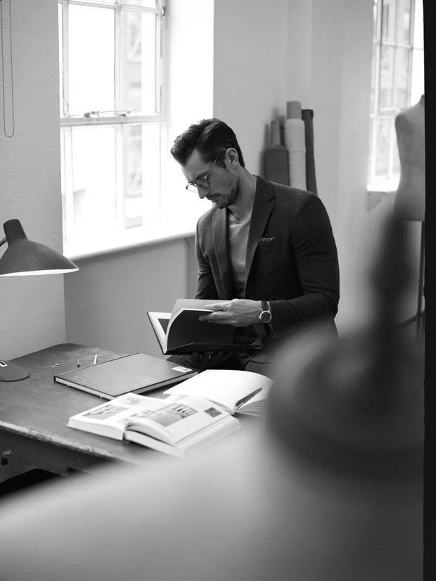
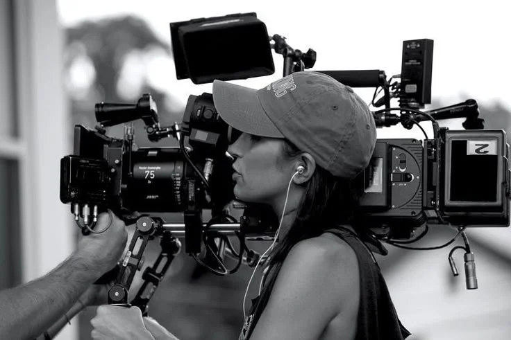
Photography direction
Creatives Are The New Athletes
The photography direction embraces the concept that “creatives are the new athletes” - positioning Teralon’s team as skilled professionals performing at the highest level. This approach captures both the craftsmanship and strategic thinking behind their work, showing the confident, “cocky” side of their creative process while maintaining professionalism.
The direction emphasizes incorporating brand colors through merchandise and environmental elements in every shot - creating subtle brand presence without forced styling. This photography direction creates a visual narrative that positions Teralon as strategic creative partners who deliver both analytical precision and creative execution - heroes bringing strategic creativity to their clients.