Second Revision
This presentation is optimized for desktop viewing.
Logo Symbol Evolution
Teralon Lion - Our Symbol
Following your feedback about keeping the current lion as the main functional symbol while exploring the expressive version, we've developed a refined approach that bridges both concepts.
Textured Lion with Strategic Dot Integration
We've created a sophisticated blend that maintains the dynamic leaping lion silhouette you preferred
Incorporated your feedback about adding dots to the new shape while avoiding the "small-pox" appearance
The dots are now thoughtfully integrated using texture and selective placement to suggest dimensionality


Touchpoint Applications
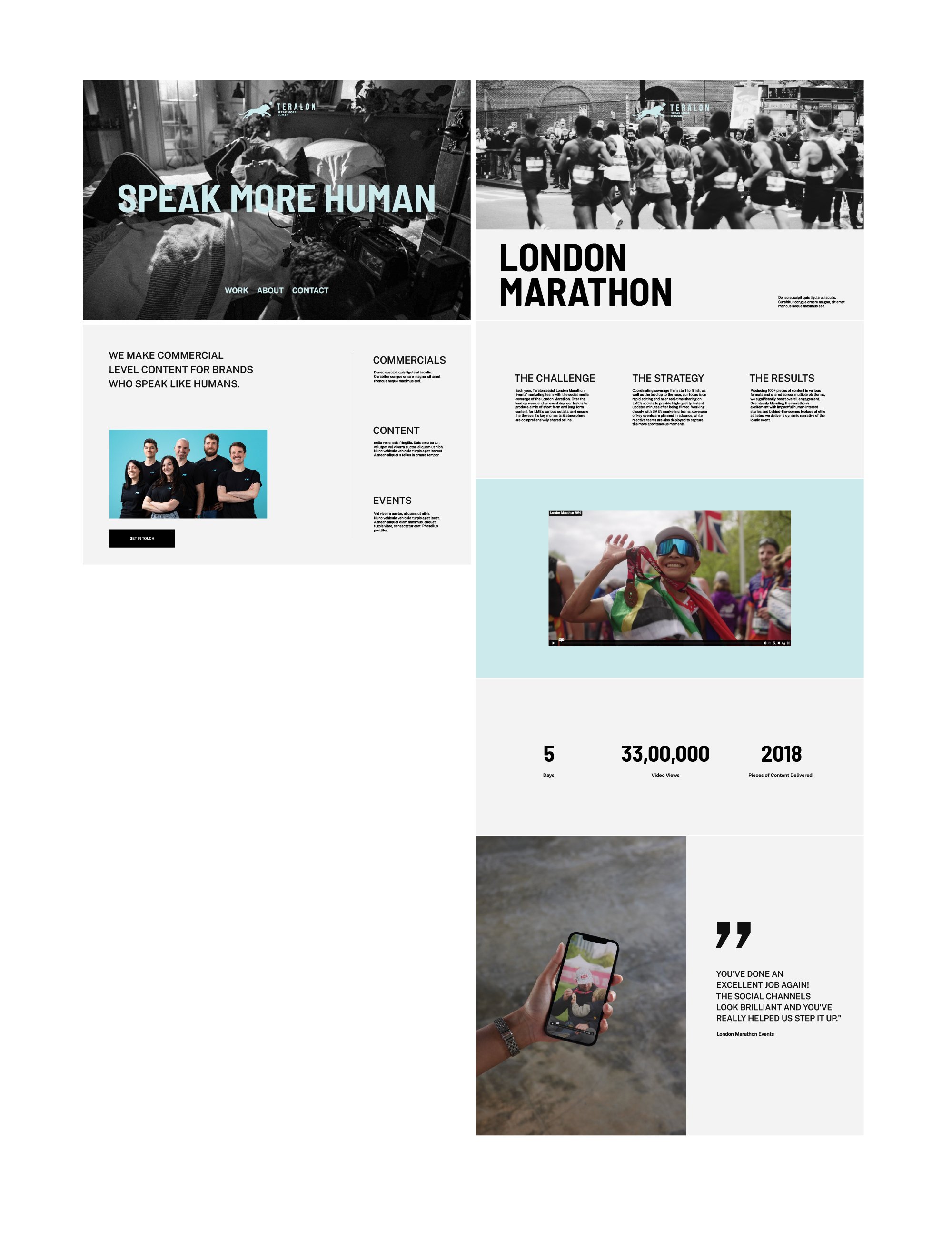
Google Slides - Expressive Direction
Based on your clarification that slides should be 60-70% expressive to tap into client emotions and aspirations, we've pushed the presentation design toward a more cinematic, emotionally engaging direction. The slides now demonstrate creativity and vision rather than just communicating facts, helping convince clients by showing Teralon's creative capabilities and values.
Key improvements:
Bold, impactful typography treatments that command attention
Strategic use of the warm color palette to create emotional connection
Integration of organic textures and film-inspired elements
Layout compositions that feel more like movie posters than corporate presentations
Note: We see significant opportunity to develop this brand asset further beyond the current package scope. If you're interested in exploring a comprehensive slide system with more templates and advanced expressive elements, we'd be happy to discuss this as a future collaboration.


Typography Refinement
All-Caps Treatment Implementation
Following your feedback about preferring titles, subtitles, and headings formatted in all-caps for a cleaner, more modern look, we've applied this approach throughout the system.
Updated Hierarchy:
BIG TITLES: Bold, impactful all-caps treatment for maximum presence
SUBTITLES: Clean all-caps formatting that maintains readability
HEADINGS: Consistent all-caps approach across all levels
Body Text: Sentence case for optimal reading experience

Touchpoints
Email signature
Clean, professional implementation that works seamlessly with the refined logo system. We'll incorporate subtle brand color accents once the final symbol is selected to add personality while maintaining professional credibility.

Touchpoints
Wetransfer Imagery
We've explored the elegant simplicity of overlaying the lion silhouette on photography, inspired by approaches like Audi's ring integration. This technique works particularly well with simpler, nature-focused imagery where the lion can breathe and integrate naturally with the content.