When Strategic Vision Meets Creative Courage
Teralon Rebrand
When Strategic Vision Meets Creative Courage
Client: Teralon - Film Production Company
Project: Complete Brand Evolution
Timeline: March - September 2025
Services: Brand Strategy, Visual Identity, Brand Guidelines
The Challenge
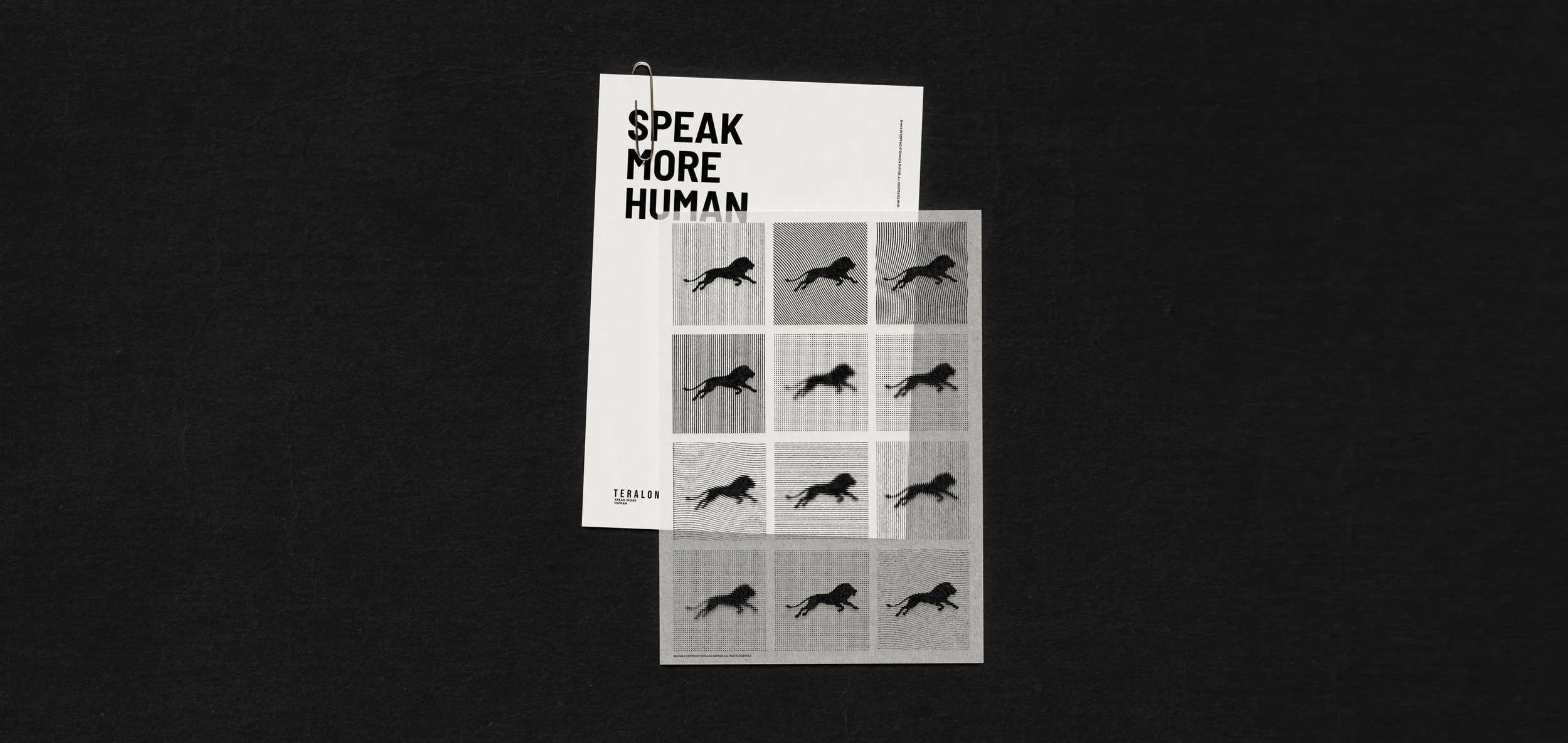
After a decade of creating high-quality commercial content for corporate clients, Teralon had outgrown its visual identity. Their work helped brands “Speak More Human,” but their own brand was stuck in a mid-2010s aesthetic—clean and professional, but lacking the character and warmth they championed for their clients.
The challenge was multi-layered:
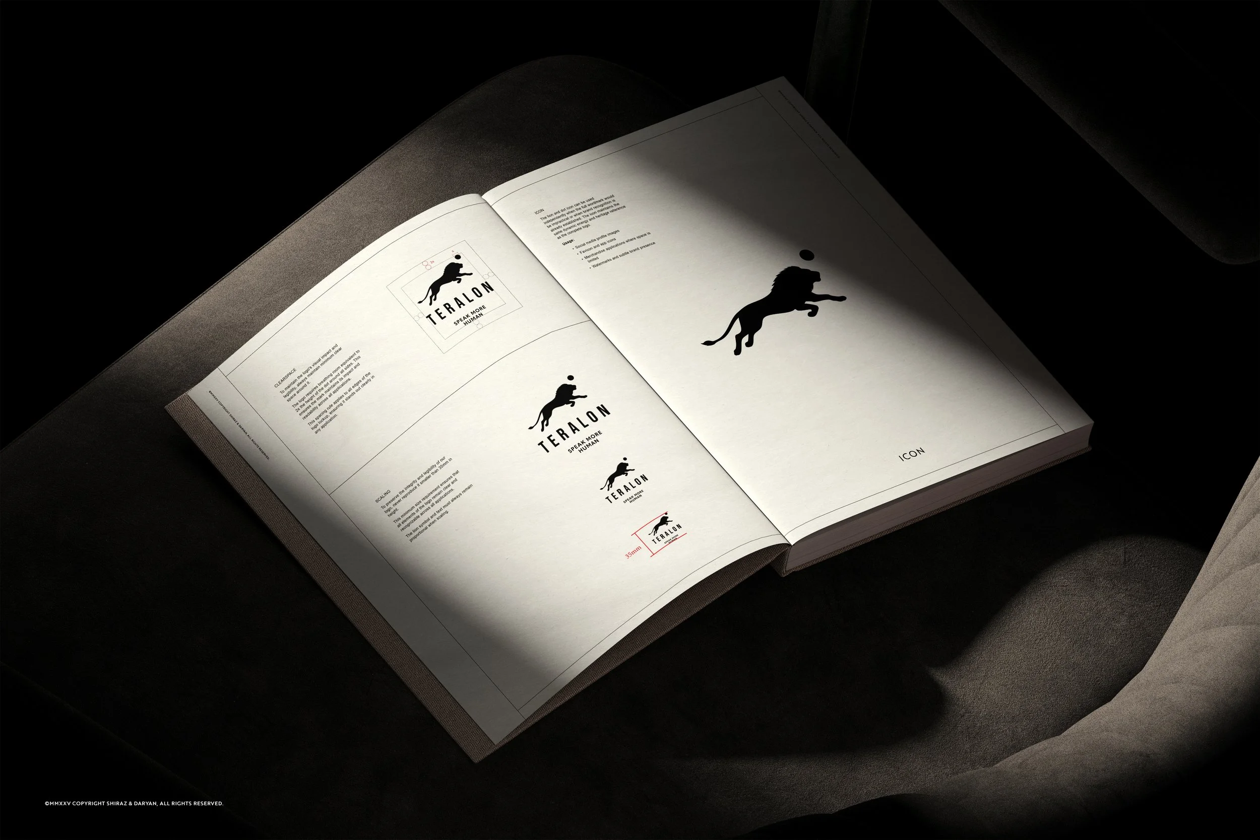
- Evolve a 10-year-old logo with significant brand equity and physical presence (including office signage and merchandise)
- Balance vintage warmth with digital precision to attract “corporate clients with an adventurous streak”
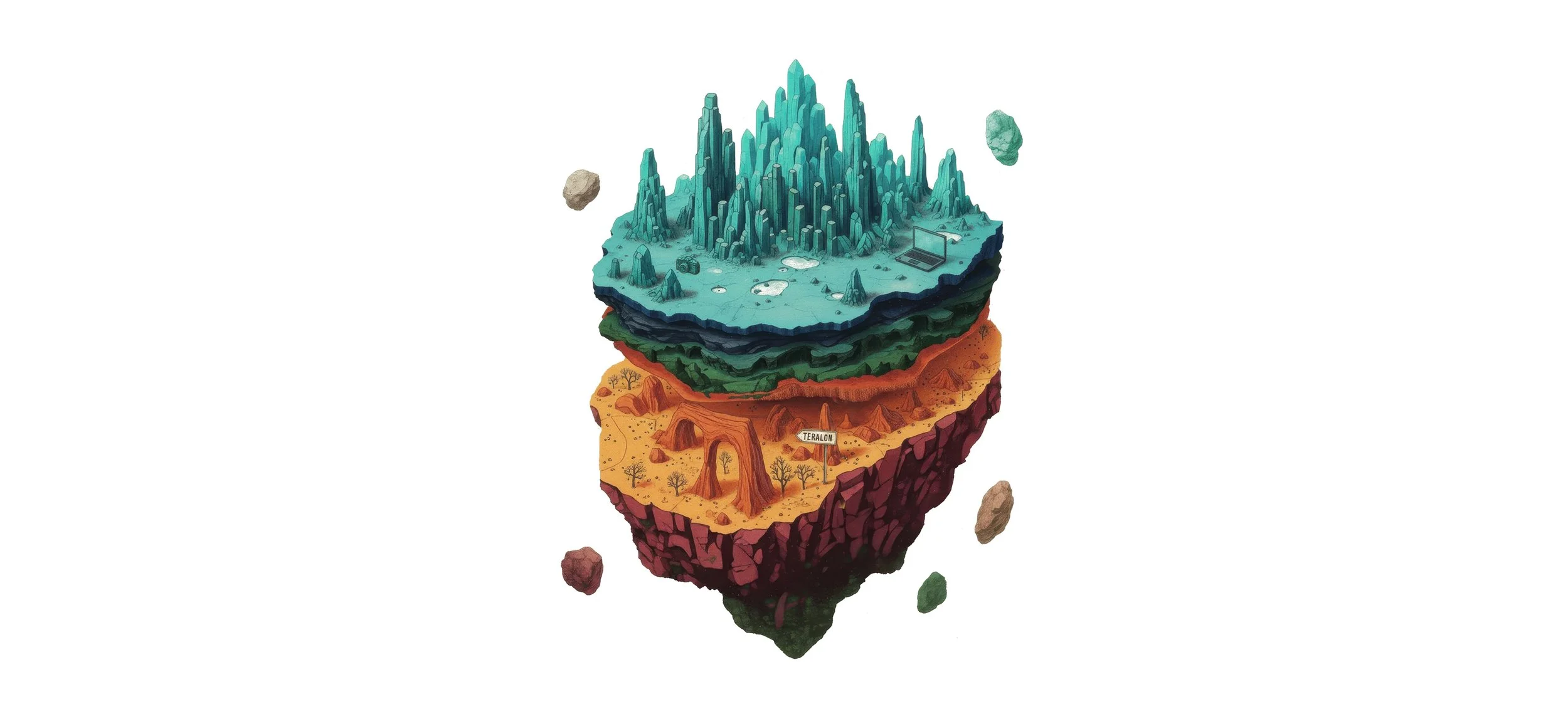
- Honor the conceptual foundation of the brand name (Teralon = “tear along the dotted line”)
- Create a system flexible enough to work across diverse applications while maintaining cohesion
Our Approach
Strategic Foundation
From our first meeting, we recognized this wasn’t about surface-level aesthetics. Julian (Co-founder at Teralon and our contact person) arrived with a methodically curated mood board—references from Bose, Aimé Leon Dore, Ralph Lauren—each chosen for specific strategic reasons, not just visual appeal.
This clarity gave us the foundation to dig deeper: What made these brands resonate? How could a film production company borrow principles from fashion and luxury goods without losing its own identity?
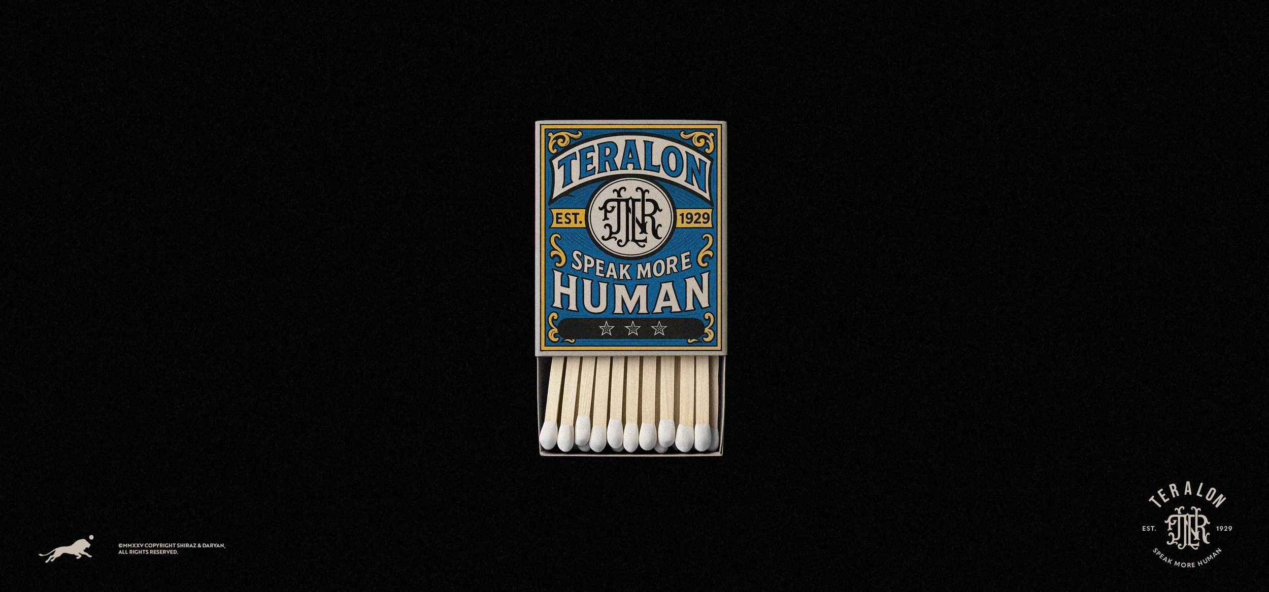
We discovered the answer wasn’t in copying vintage aesthetics, but in understanding the qualities that made them compelling: warmth, texture, human touch, confident restraint.
The Creative Leap
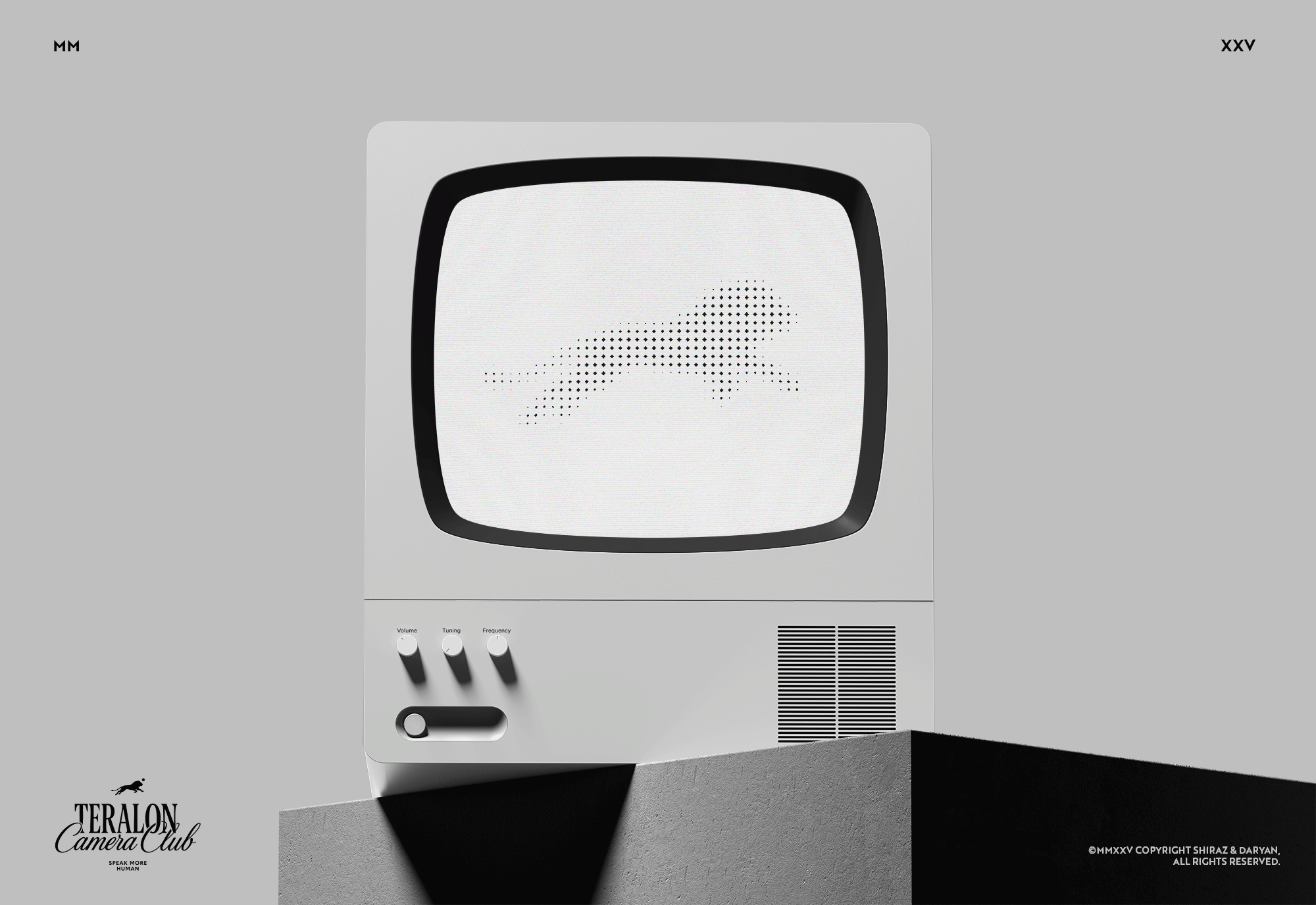
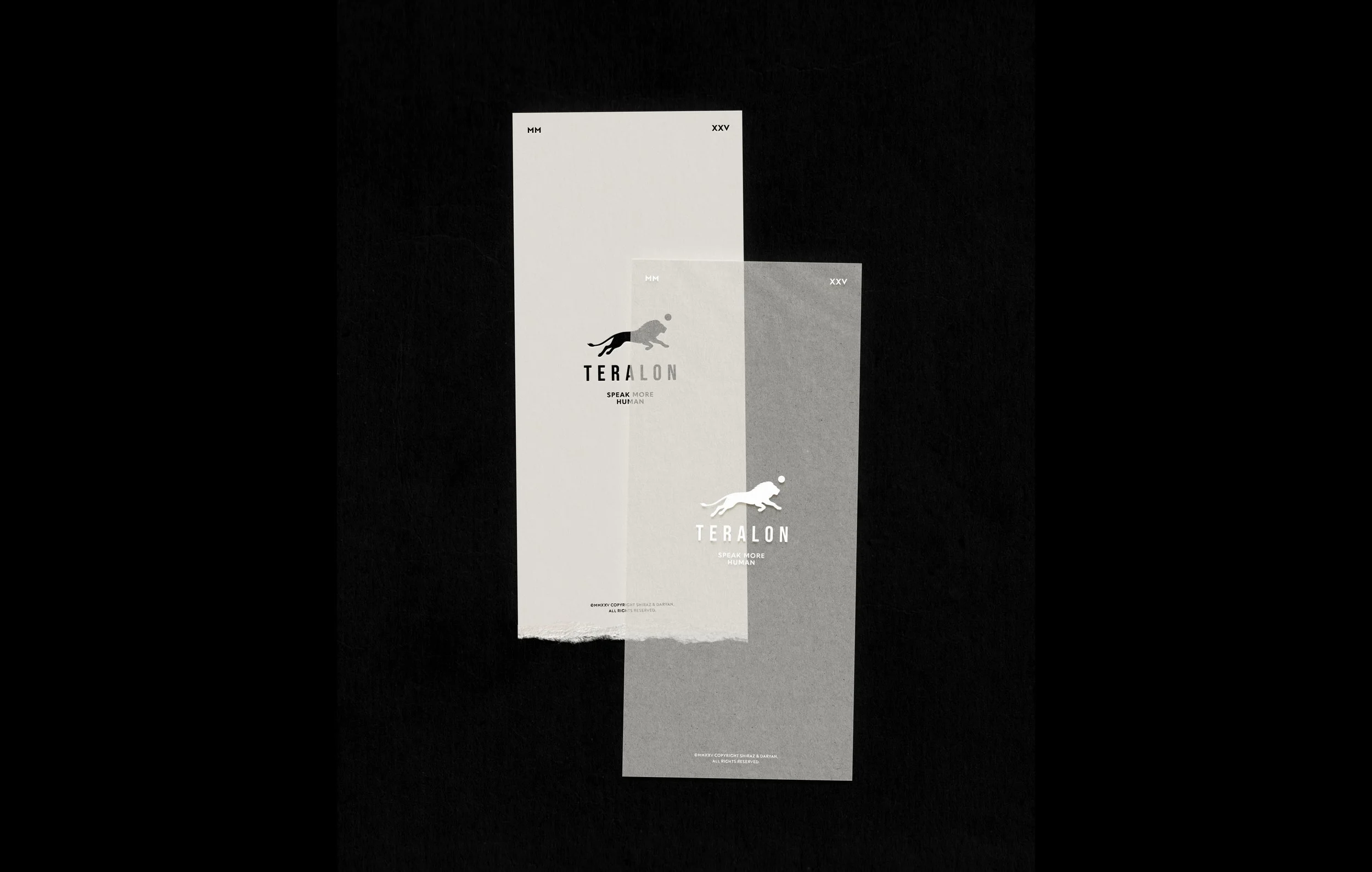
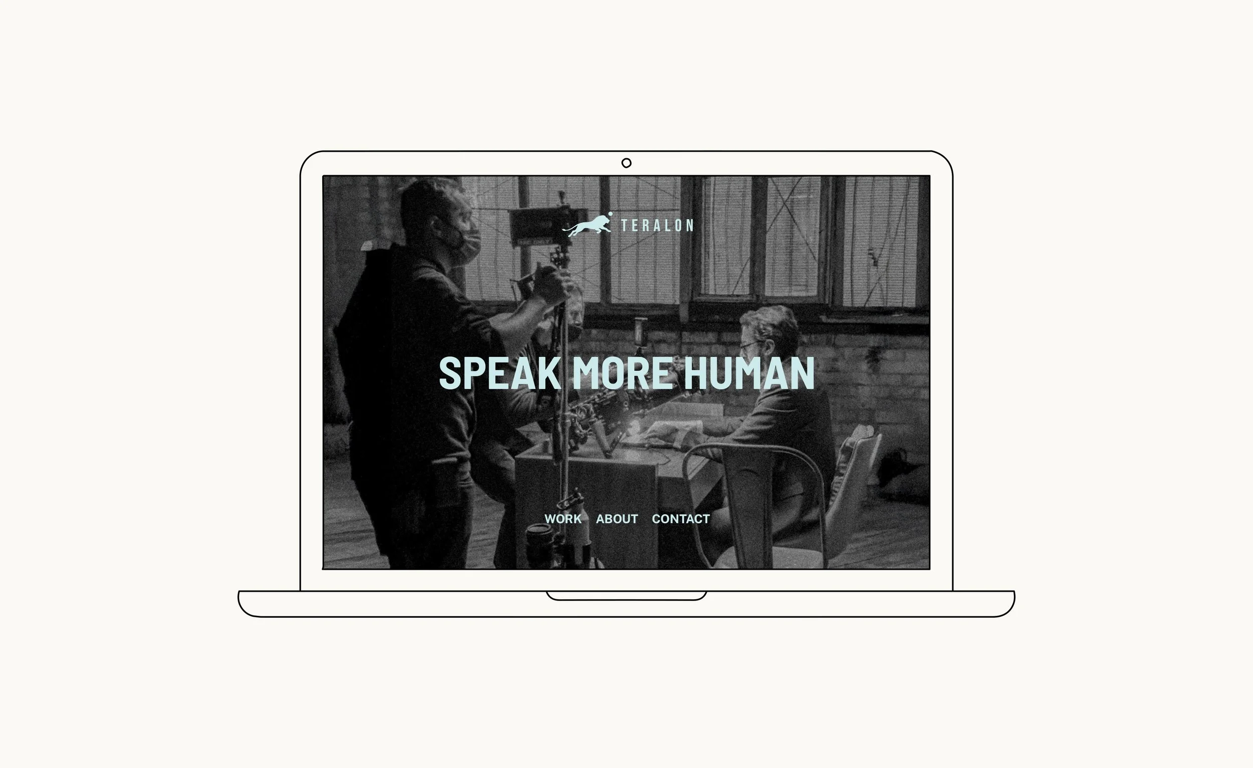
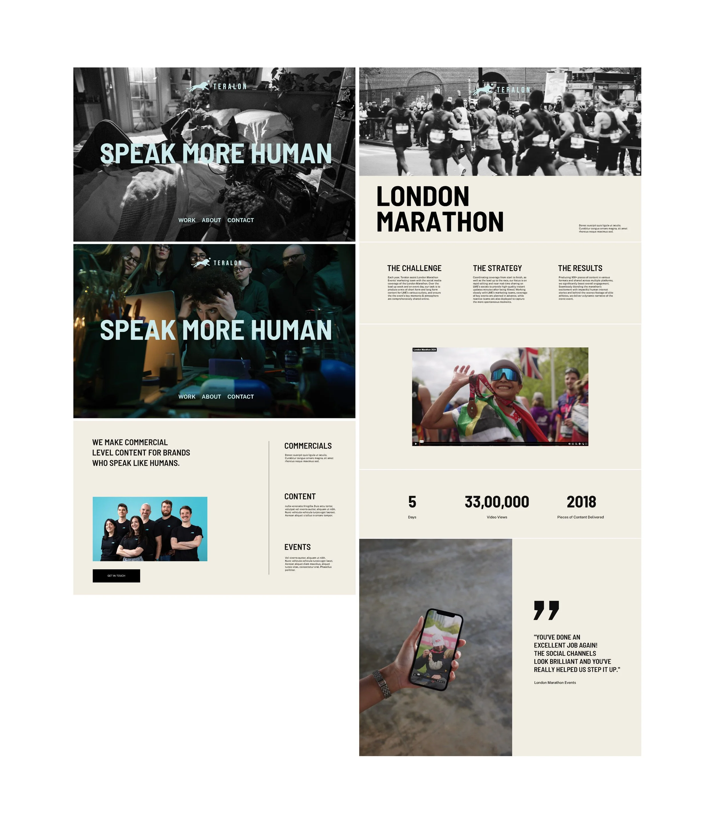
The logo presented our biggest creative challenge and opportunity. The existing lion icon with scattered dots had served the brand well, but felt static—more guardian than guide.
Our concept: a leaping lion in dynamic pose with a single dot deliberately placed outside its form. This wasn’t just simplification—it was evolution made visible. The heritage remained (lion + dot), but reimagined with contemporary confidence.
When we presented this concept, Julian’s initial response was thoughtful uncertainty. The dynamic pose triggered associations with athletic brands. Rather than immediately revise, we proposed something unconventional: time.
Julian sat with the concept for days, sharing it with his team and consulting branding experts. What emerged was deeper understanding—this wasn’t an ordinary approach, but expressing Teralon’s true energy: forward-moving, purposeful, alive.
Building the System
With the logo evolution established, we developed a comprehensive brand system:
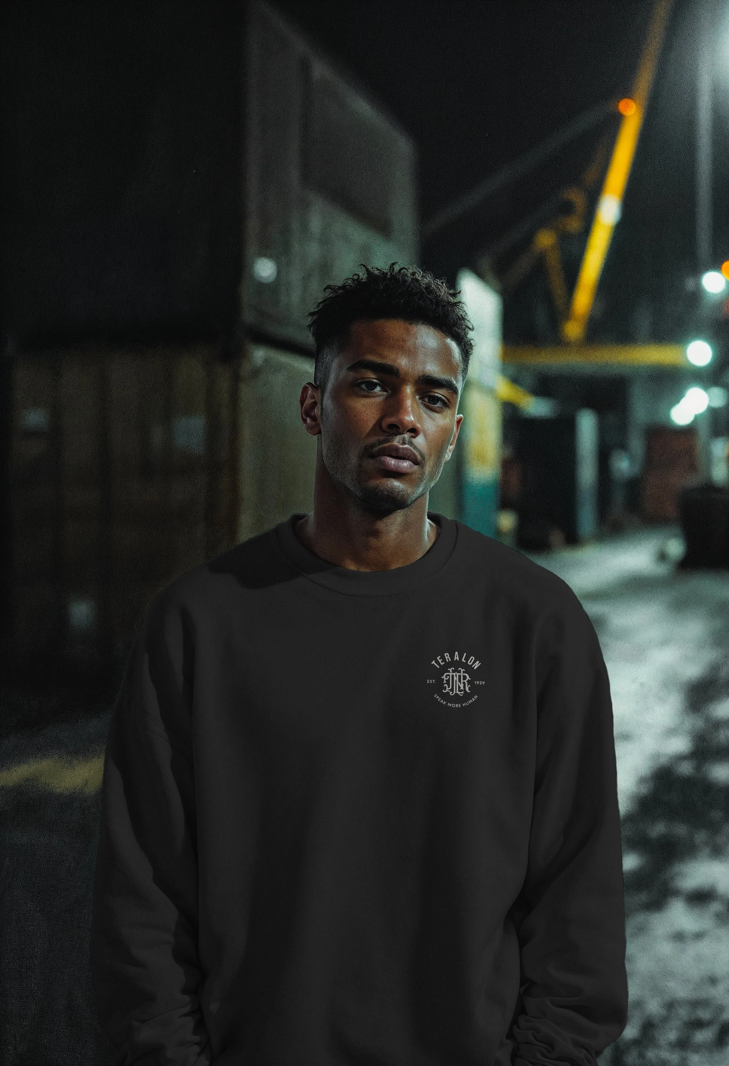
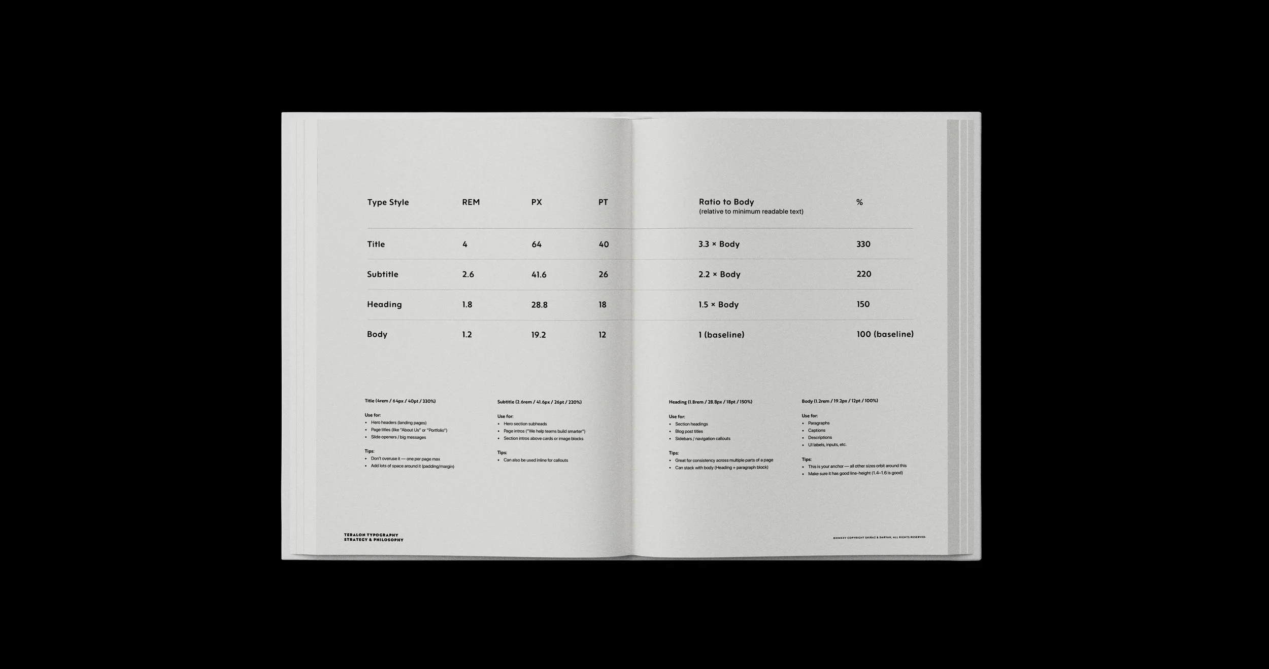
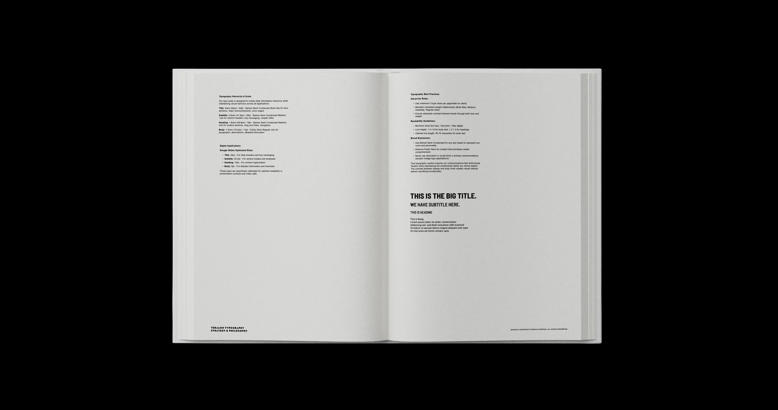
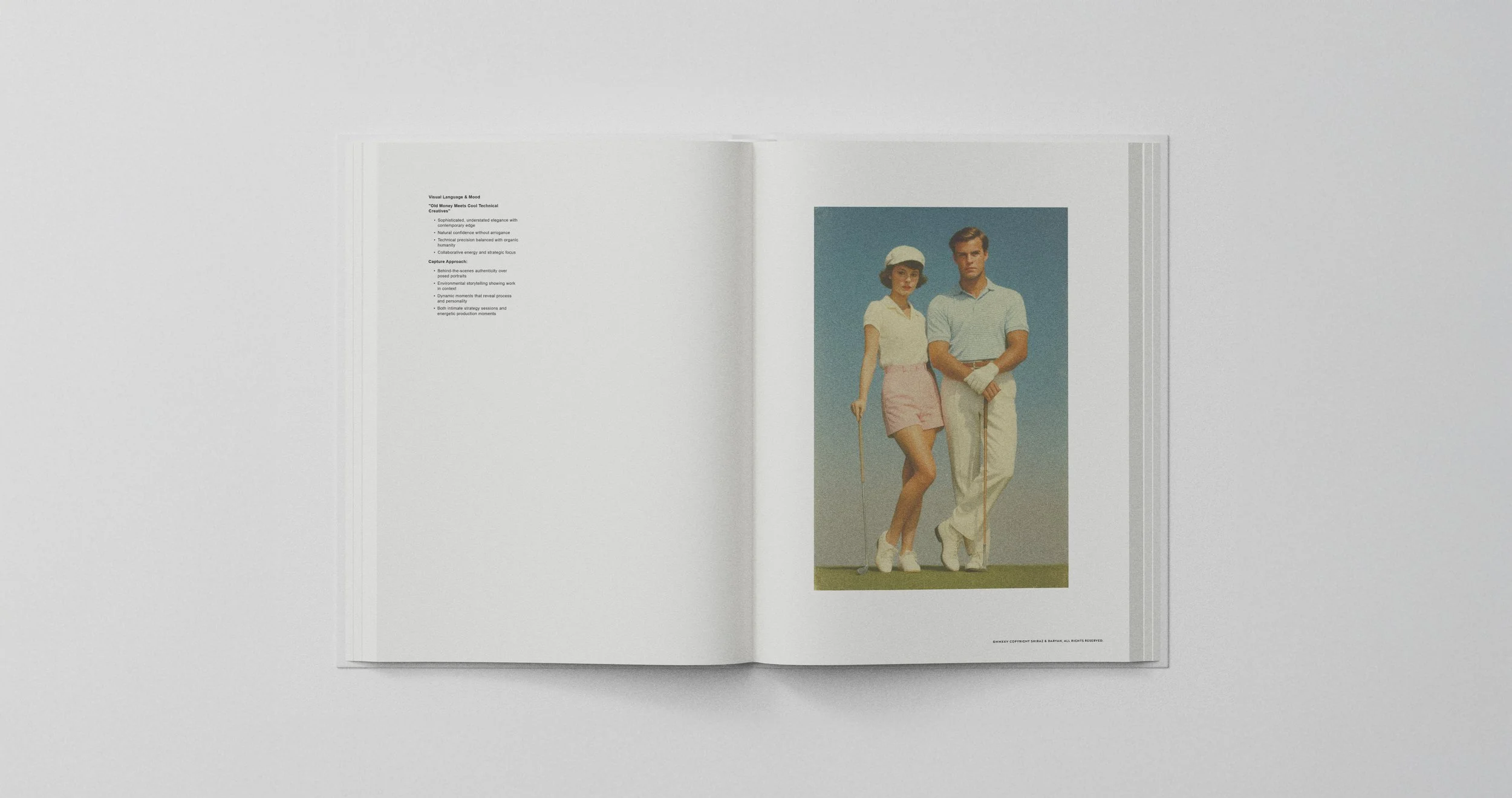
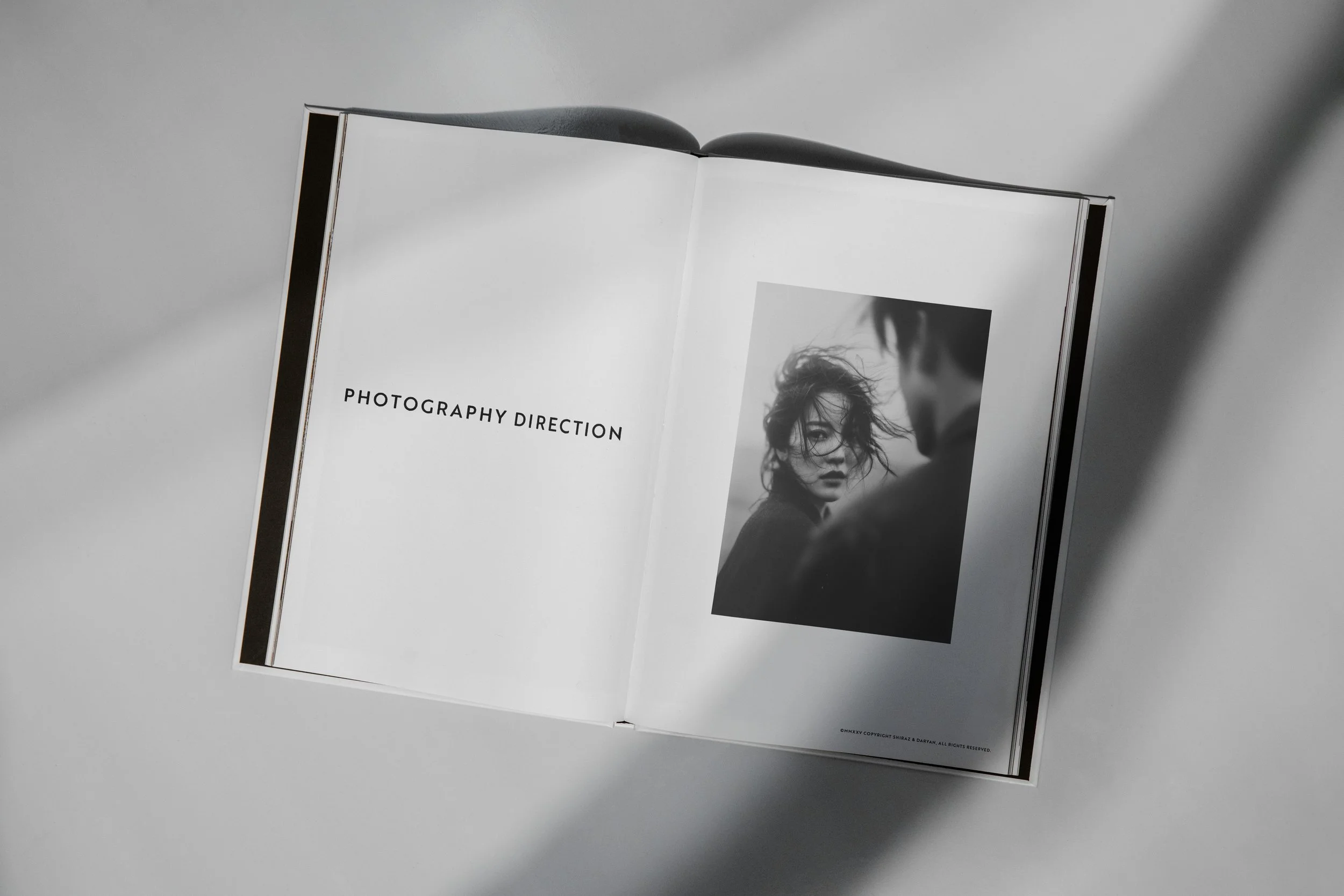
Visual Language: Clean structural elements that let Teralon’s photography carry character and warmth—recognizing that their art form is visual storytelling, not graphic embellishment.
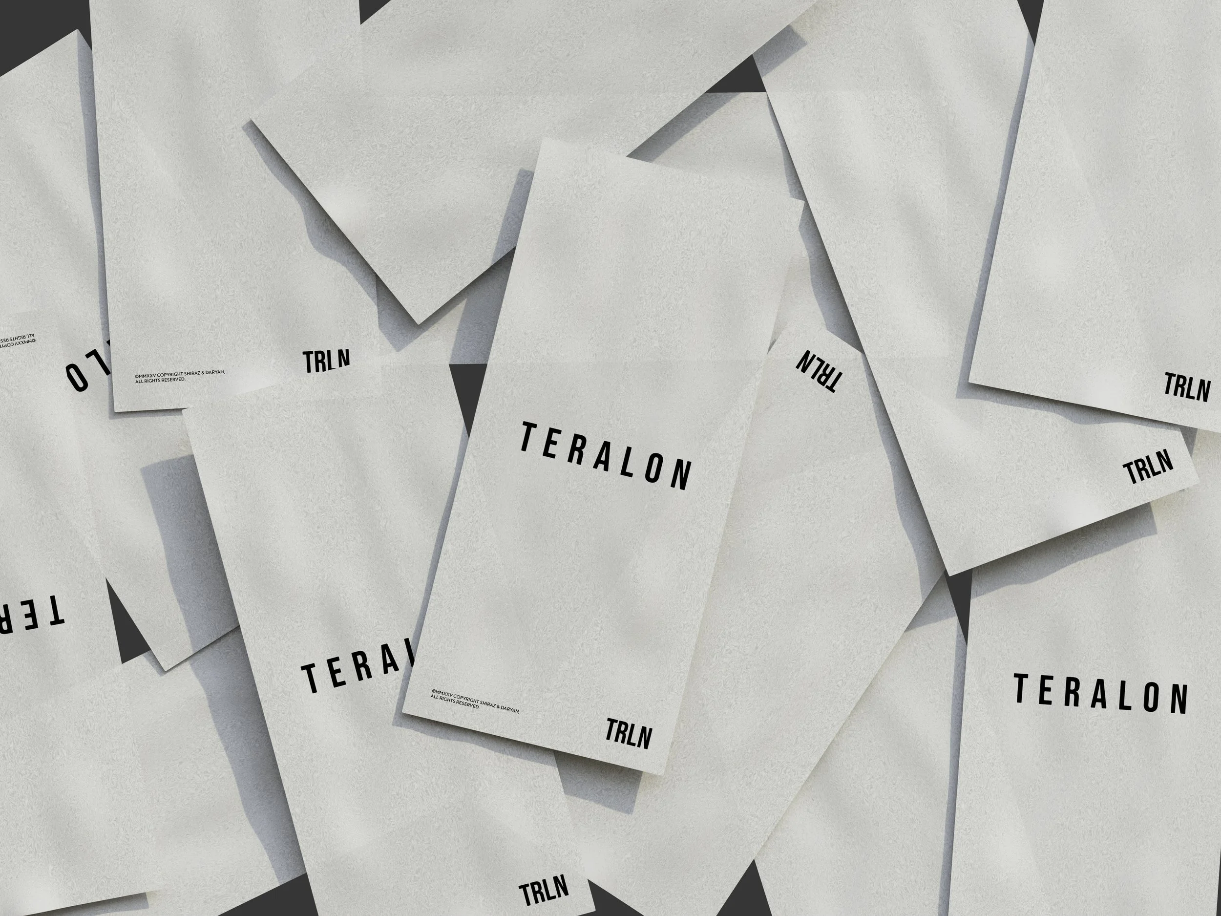
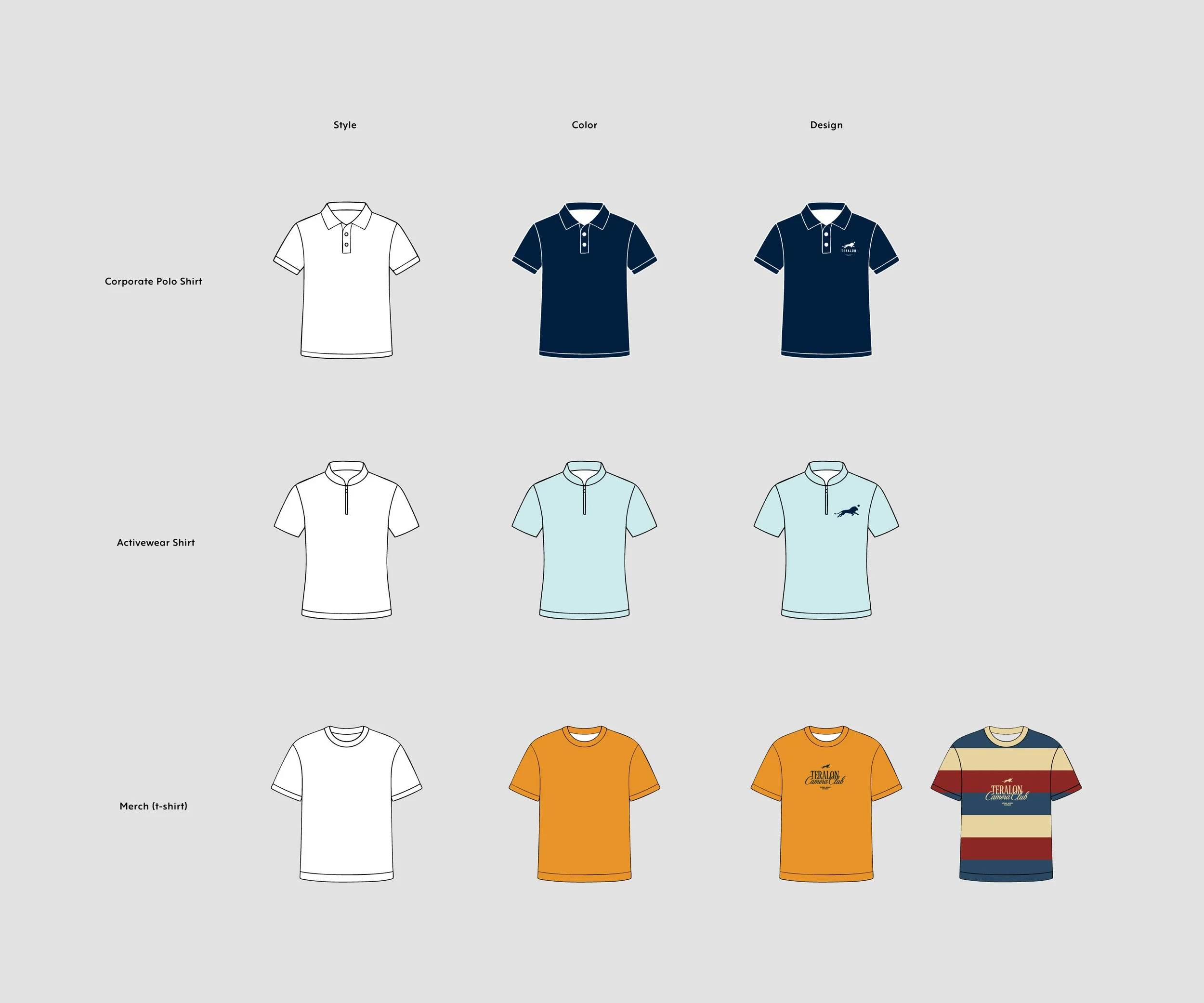
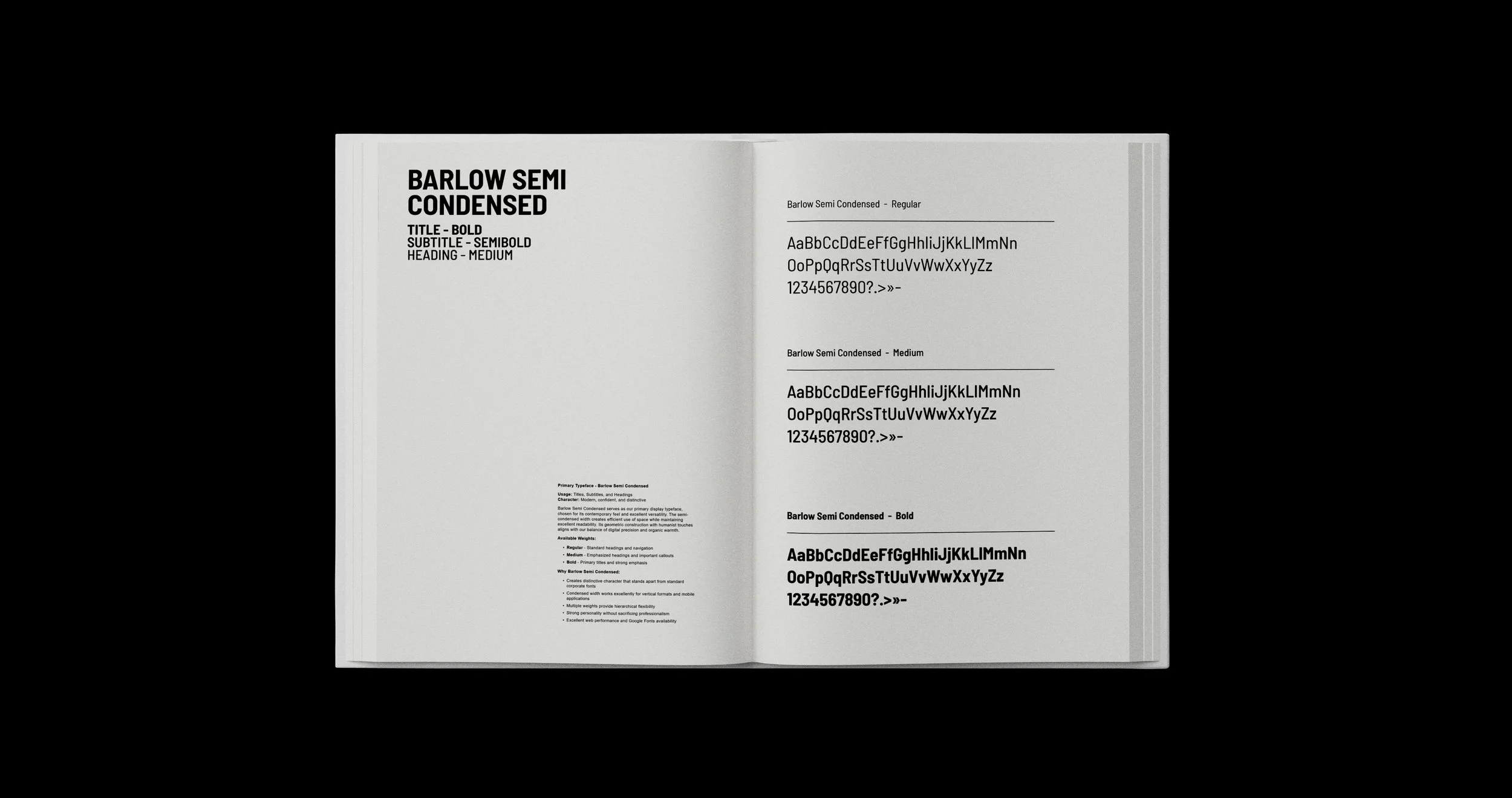
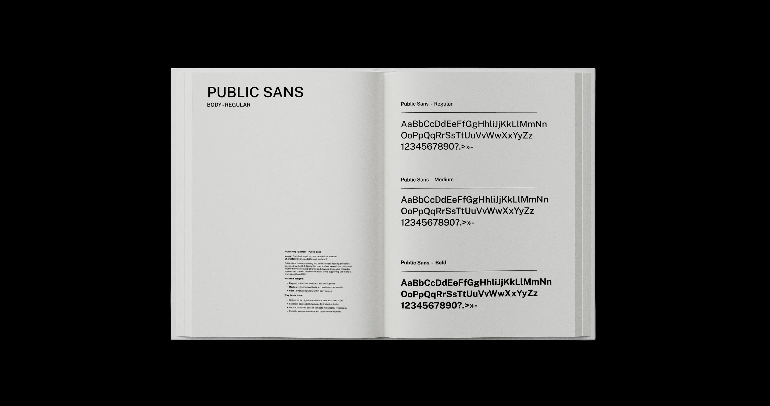
Typography: Barlow font family for its contemporary clarity with subtle vintage softness, offering 18 styles for maximum flexibility.
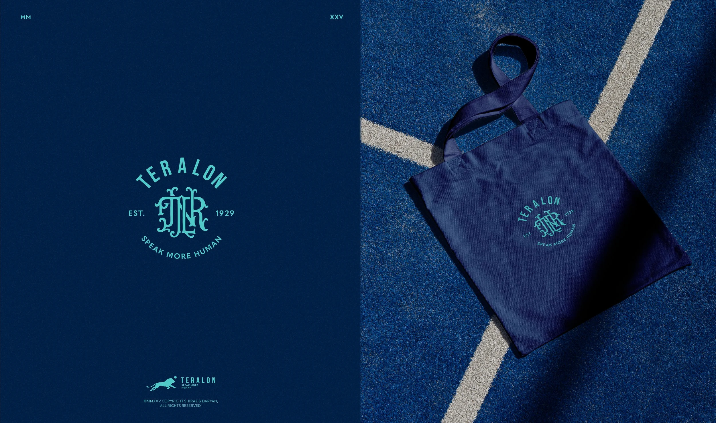
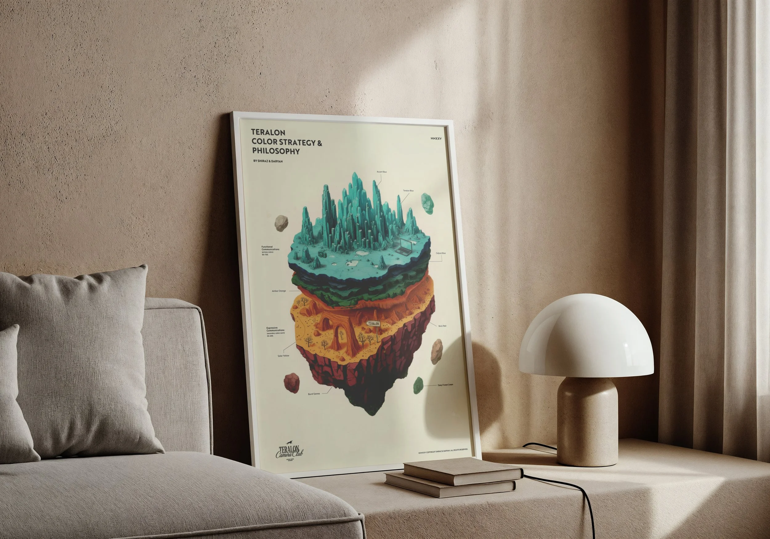
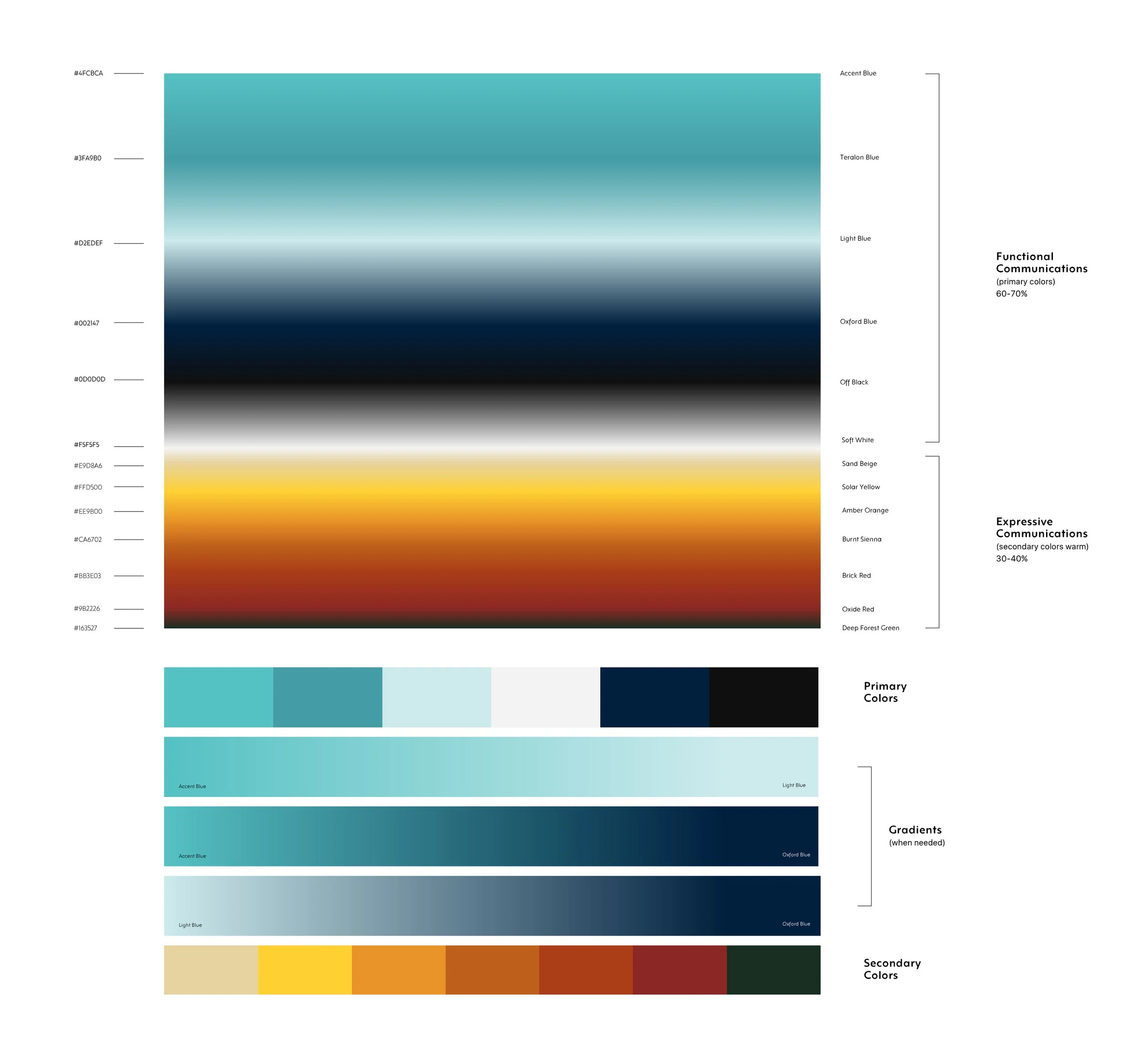
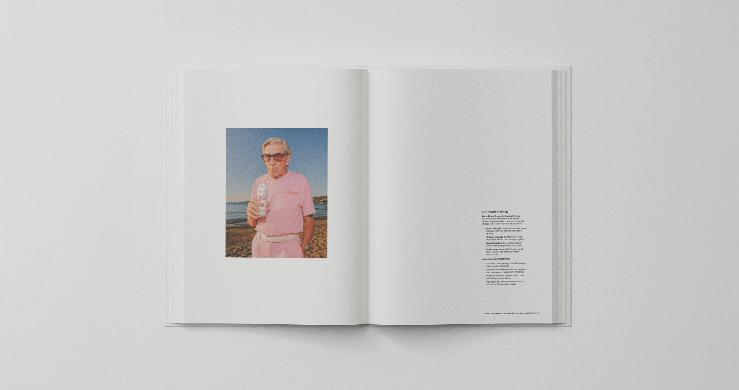
Color Strategy: Cool primary colors (black, white, refined teal, navy) balanced by warm secondary tones introduced through carefully art-directed photography.
Application Framework: Guidelines that work across website, social media, presentations, merchandise, and internal documents—each expression appropriate to context while maintaining brand cohesion.
The Impact
A Brand That Reflects Reality
The rebrand didn’t transform Teralon into something new—it made visible what they’d already become. A strategic creative partner who helps brands communicate more humanly, backed by production excellence and thoughtful decision-making.
Client Feedback:
"This project has been exactly what we needed. The level of strategic thinking alongside the creative work—that's what sets this apart. You've helped us articulate visually what we've been building for a decade. The new identity feels like us, just more confident, more intentional. Our team is genuinely proud of where we've landed."— Julian Wakefield, Co-Founder
Project Outcomes
• Comprehensive brand guidelines delivered, positioning Teralon for phased rollout through fall 2025
• Complete visual identity system spanning logo evolution, typography, color, and application frameworks
• Team alignment and enthusiasm for the new direction, with internal stakeholders expressing pride in the evolution
• Strategic foundation established for planned photoshoot and gradual implementation across all touchpoints
• Brand system designed for both immediate application and long-term flexibility as Teralon continues to grow
What Made This Work
Mutual Evolution
Great creative partnerships require both sides to grow. Julian challenged us to think like film production professionals—understanding that character comes from imagery, not graphics. We introduced strategic frameworks that helped Teralon articulate why certain visual choices worked.
Strategic Patience
By building in reflection time and regular touchpoints rather than rush to decisions, we created space for authentic creative development. The logo that initially triggered uncertainty became the solution everyone believed in—not through convincing, but through understanding.
Cultural Intelligence
Working across Swedish, British, and Persian communication styles enriched rather than complicated the process. We learned to lead with strategic context (Swedish directness), frame feedback collaboratively (British politeness), and read between the lines (Persian subtlety).
Key Learnings
Strategy gives creativity its power. The tightest constraints—must honor heritage, must feel premium, must work across contexts—became the catalyst for innovation rather than limitation.
Time is a creative tool. Rushing to approval produces reactive decisions. Allowing reflection produces resonant ones.
Explain the “why” alongside the “what”. Strategic rationale transforms clients from approvers to collaborators, elevating the entire relationship.
The best work happens at intersections. Film production meeting graphic design. Heritage meeting innovation. Cool professionalism meeting warm approachability.


Project Credits
Client Team:
Julian Wakefield - Co-Founder & Director
Guy Ellis - Co-Founder & Director
Freddie Wakefield - Senior Editor
Veronica Doncheva - Producer
Andrei Lionachescu - Director of Photography
Emilia Crudo - Video Editor
Shiraz and Daryan:
Zara Shirazi - Creative Director & Strategic Lead
Amir Daryani - Art Director & Senior Designer
This case study documents a six-month collaboration between Teralon and Shiraz and Daryan, developed through multiple in-depth discovery sessions, iterative design phases, and comprehensive rebrand planning.SUGGESTED PROJECTS